#projecthipsterfarmhouse

this project was a blast. it was quick and it's all a bit of a blur, but I love how we mix and matched and used so many original elements of the house.

let's start with that. repurposing. this was important to the homeowners for a few reasons, 1)budget. we saved big time by upcycling; 2) there was nothing really wrong with the materials. they were quality, but they needed to be updated and repositioned for the new layout. it helped that the contractor was fully up for this challenge!

let me break it down for you :)

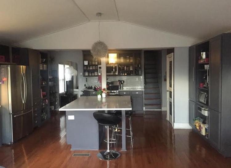
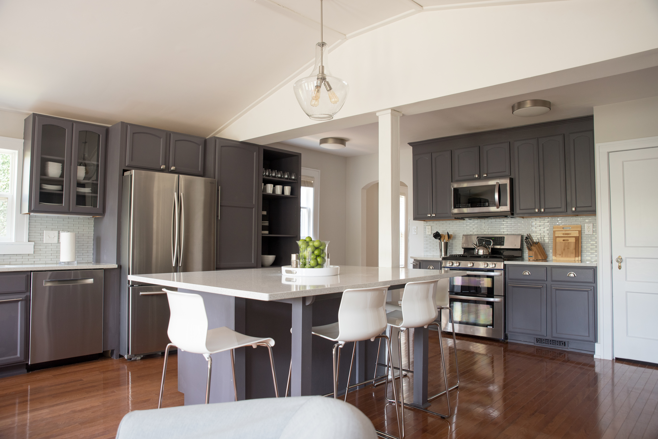
kitchen cabinets (the before and after)

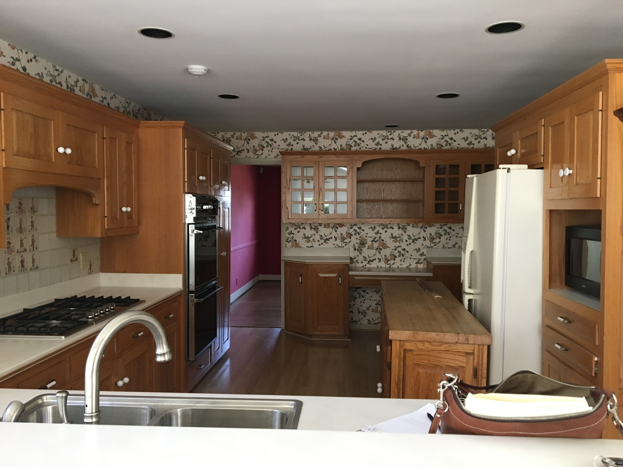
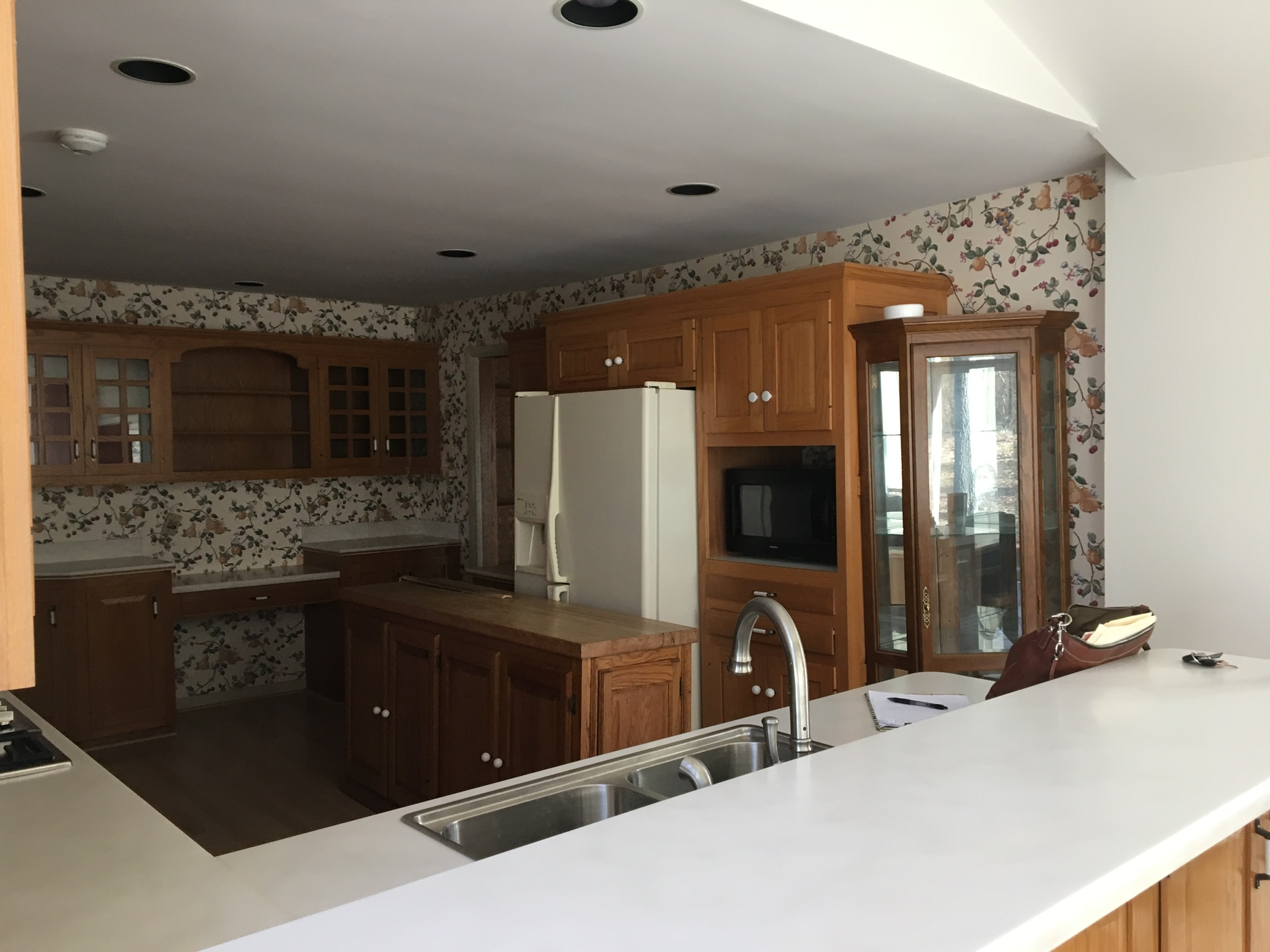
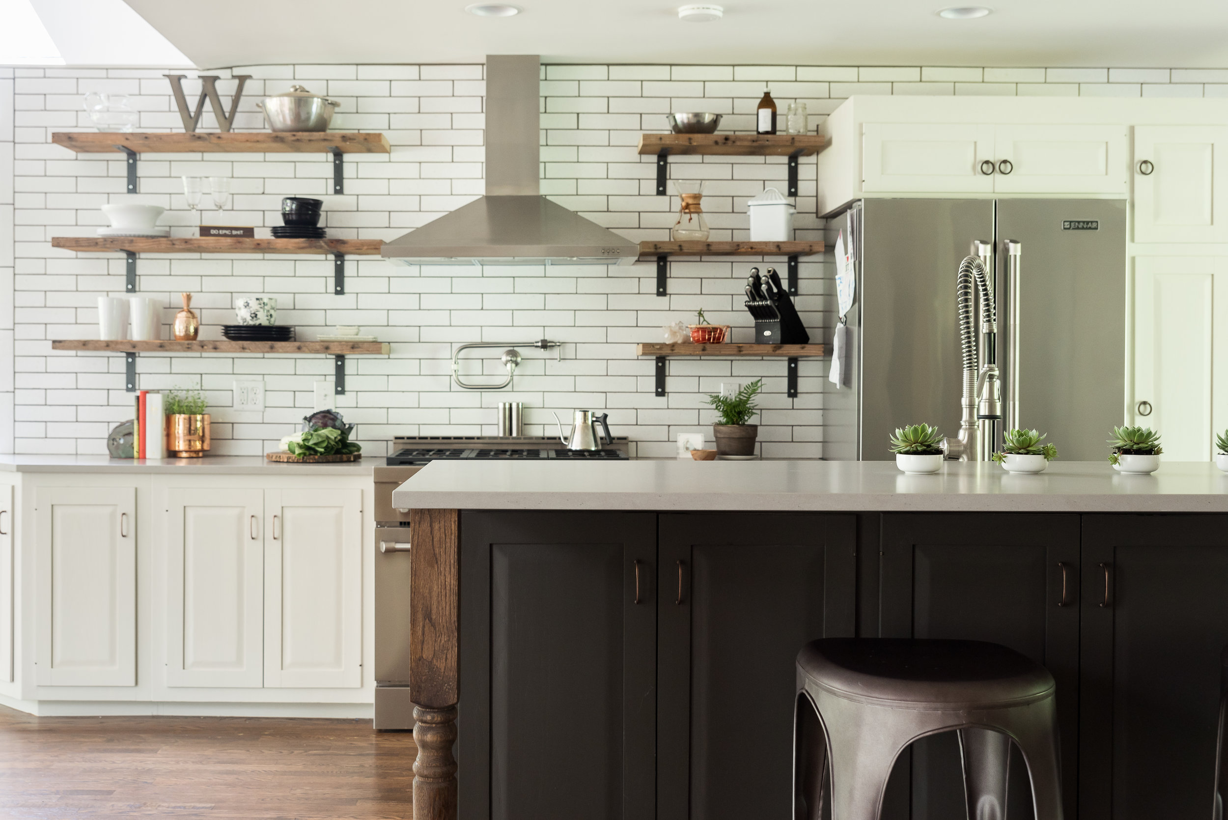
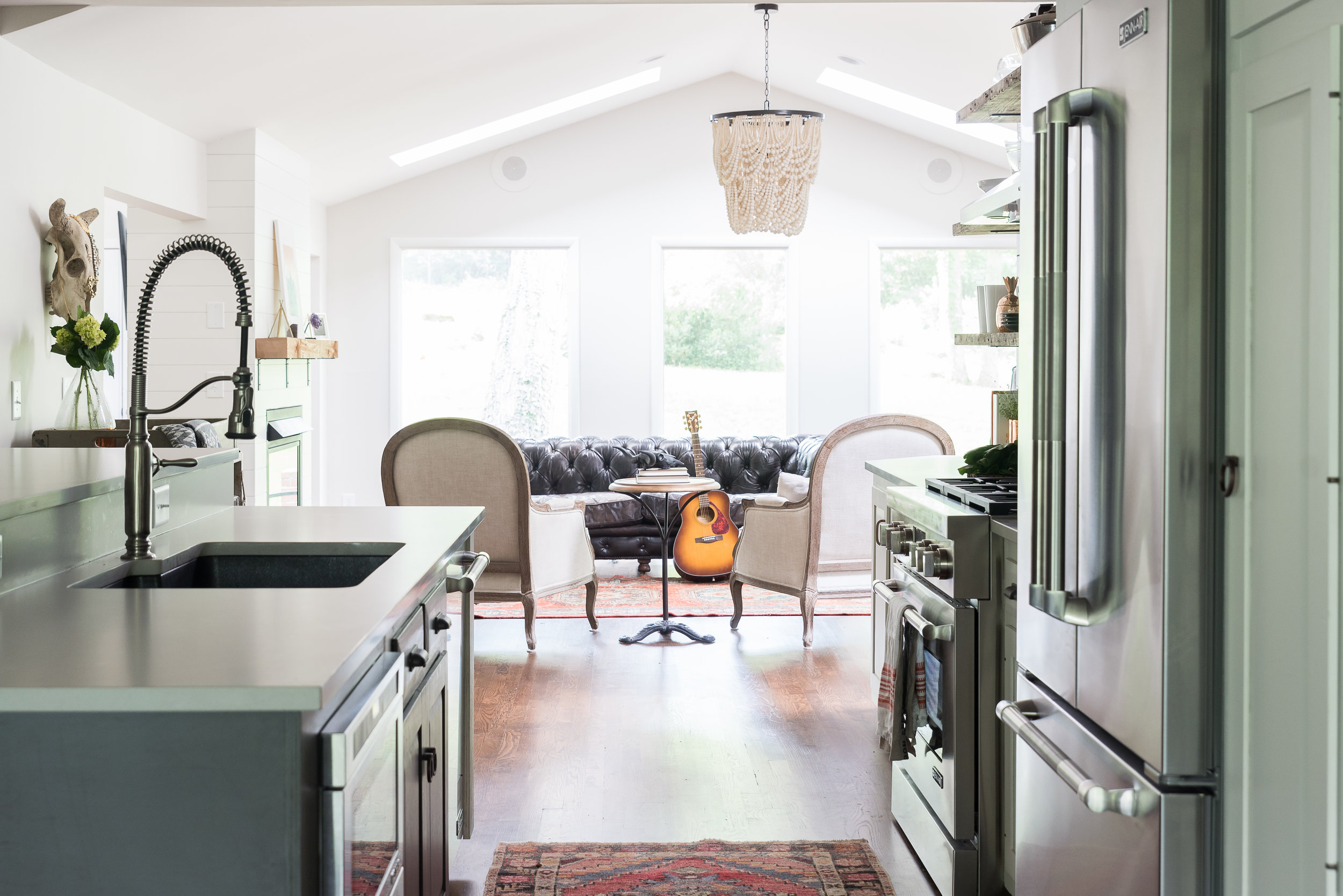
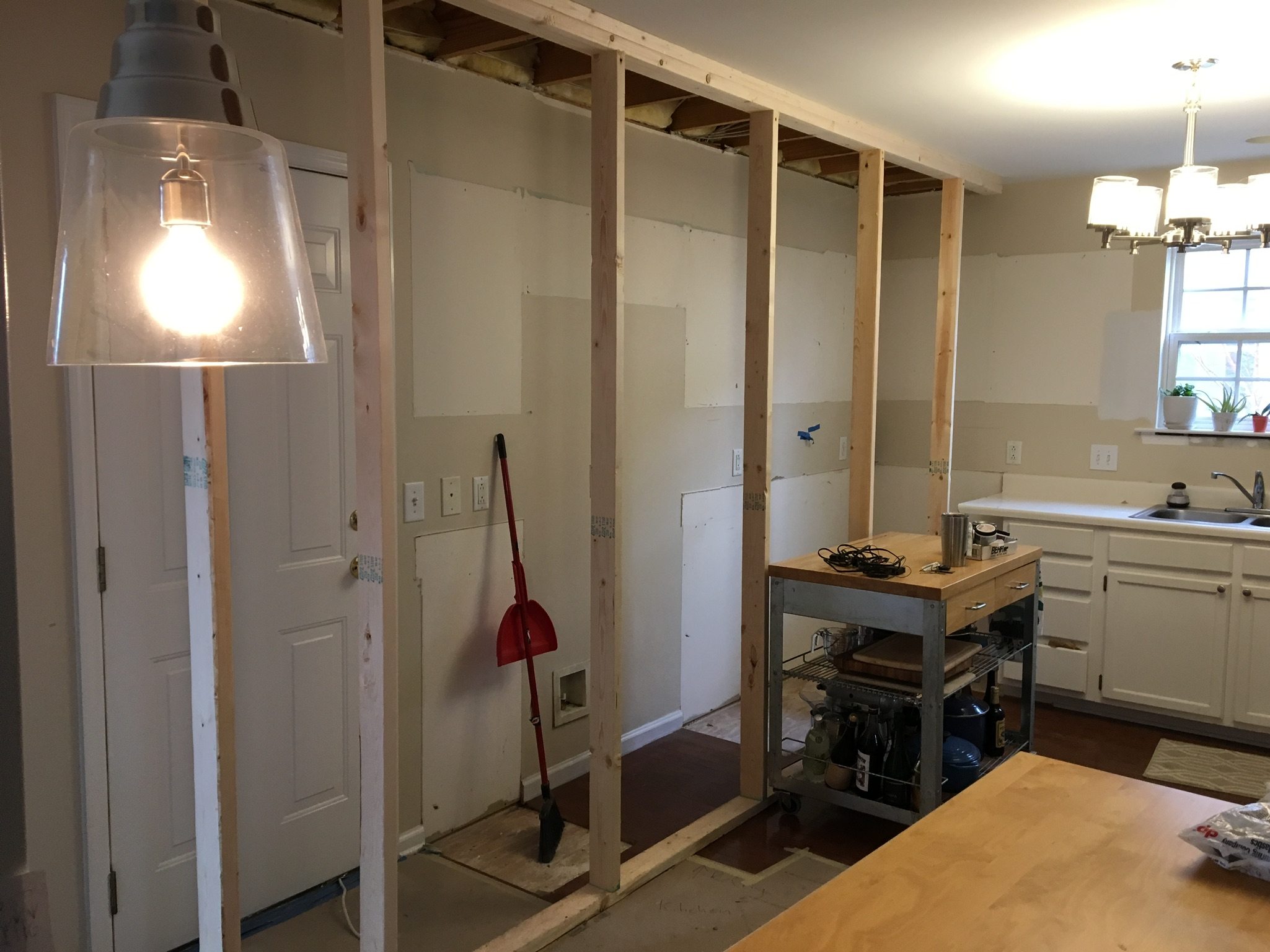
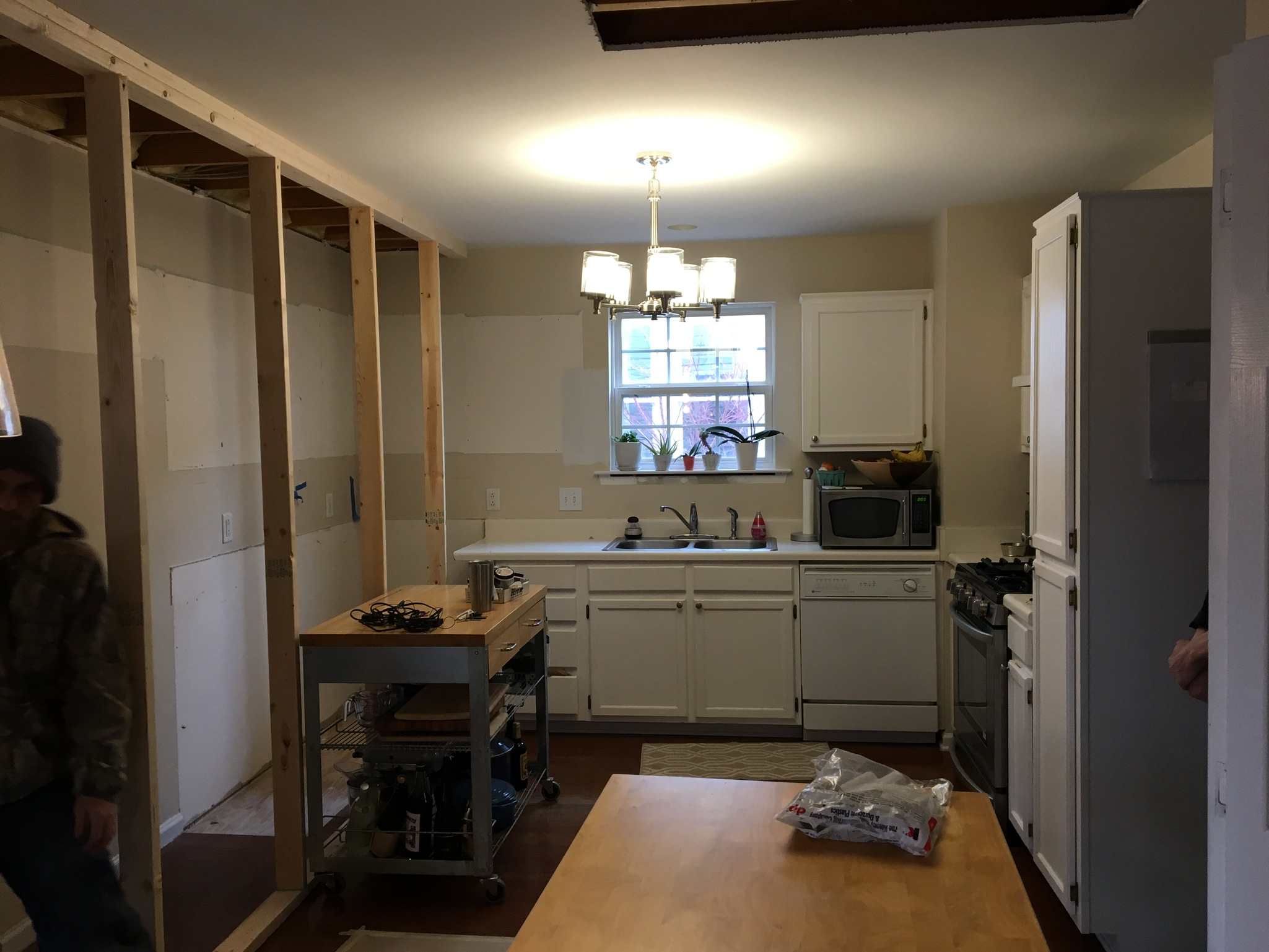
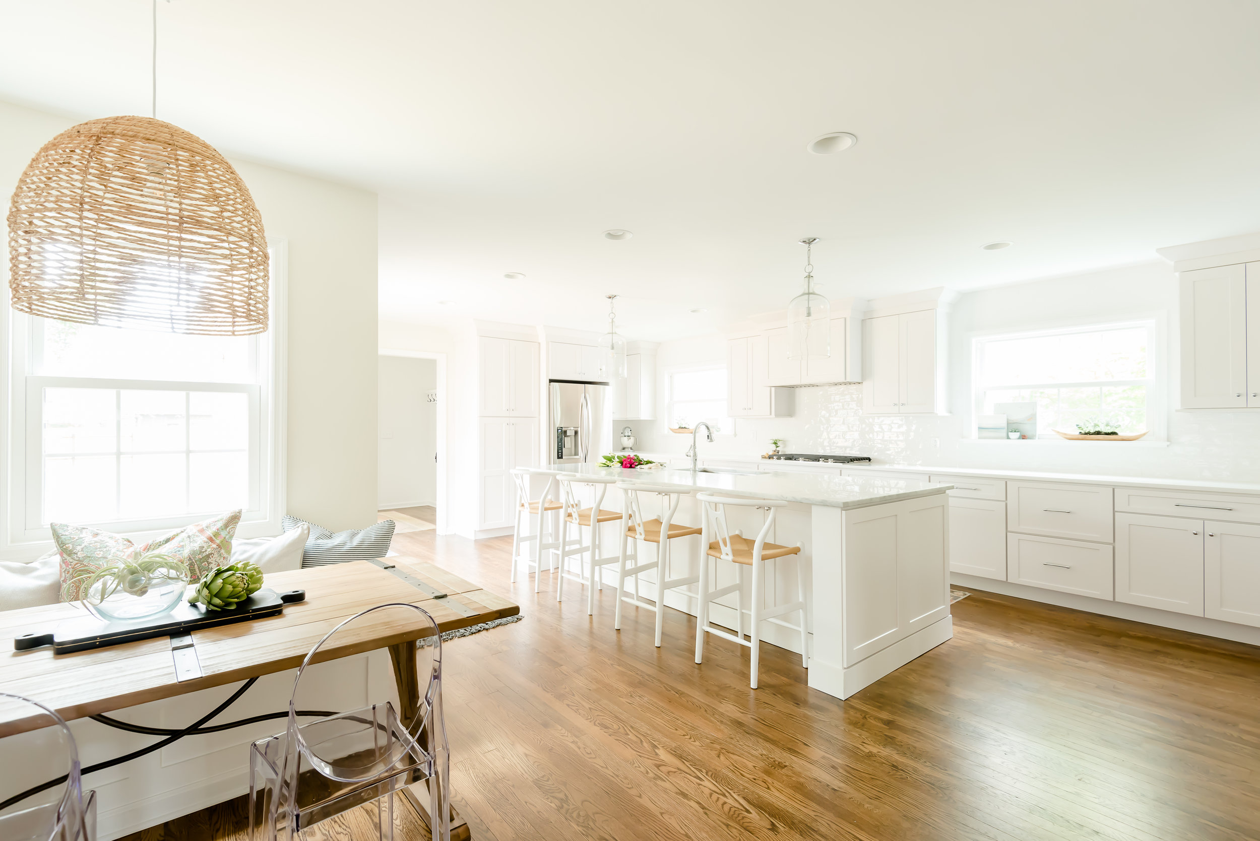
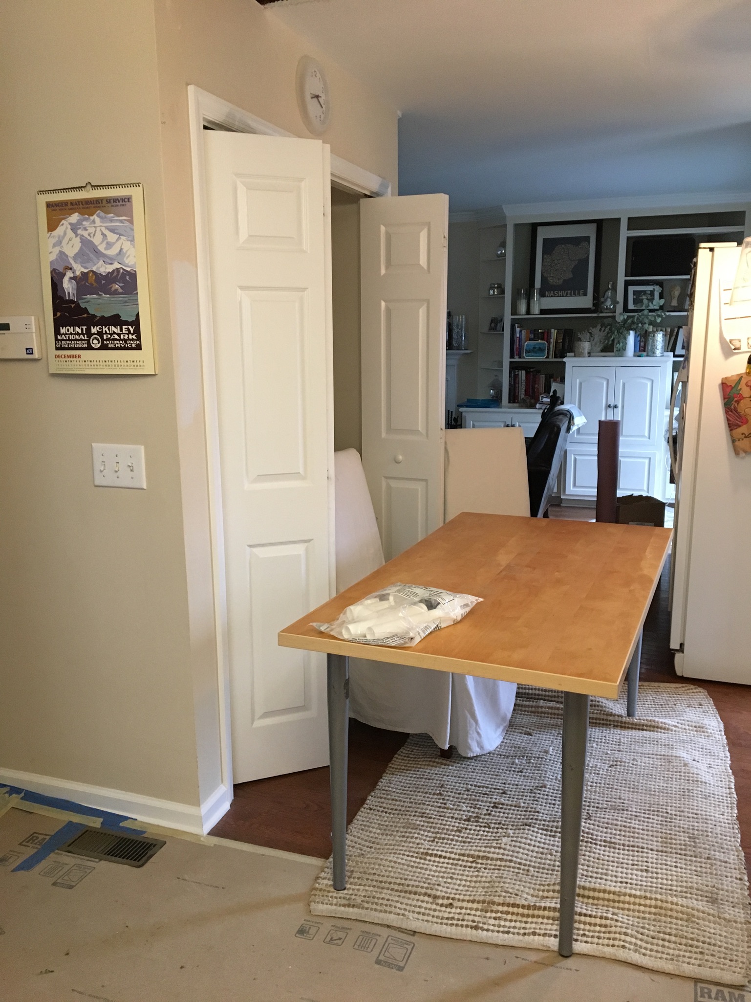
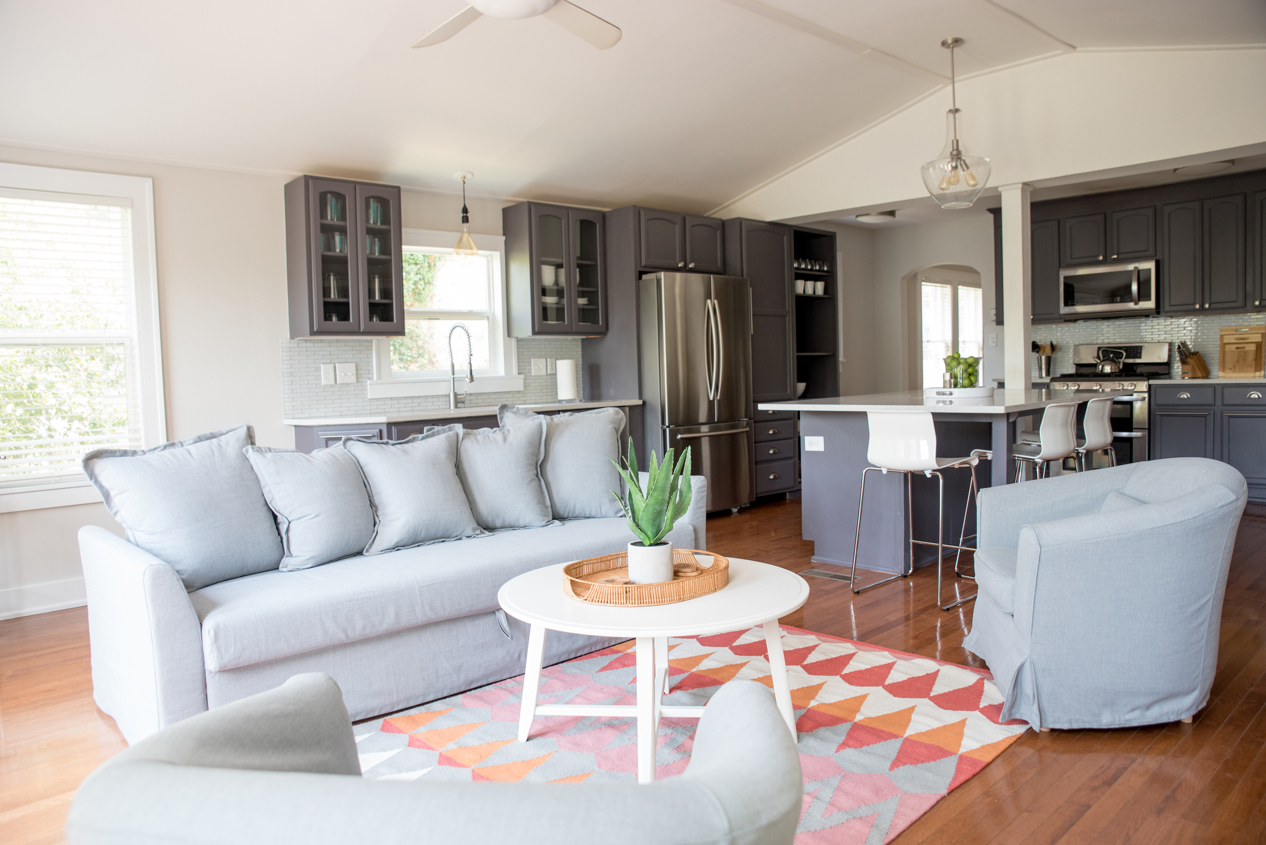
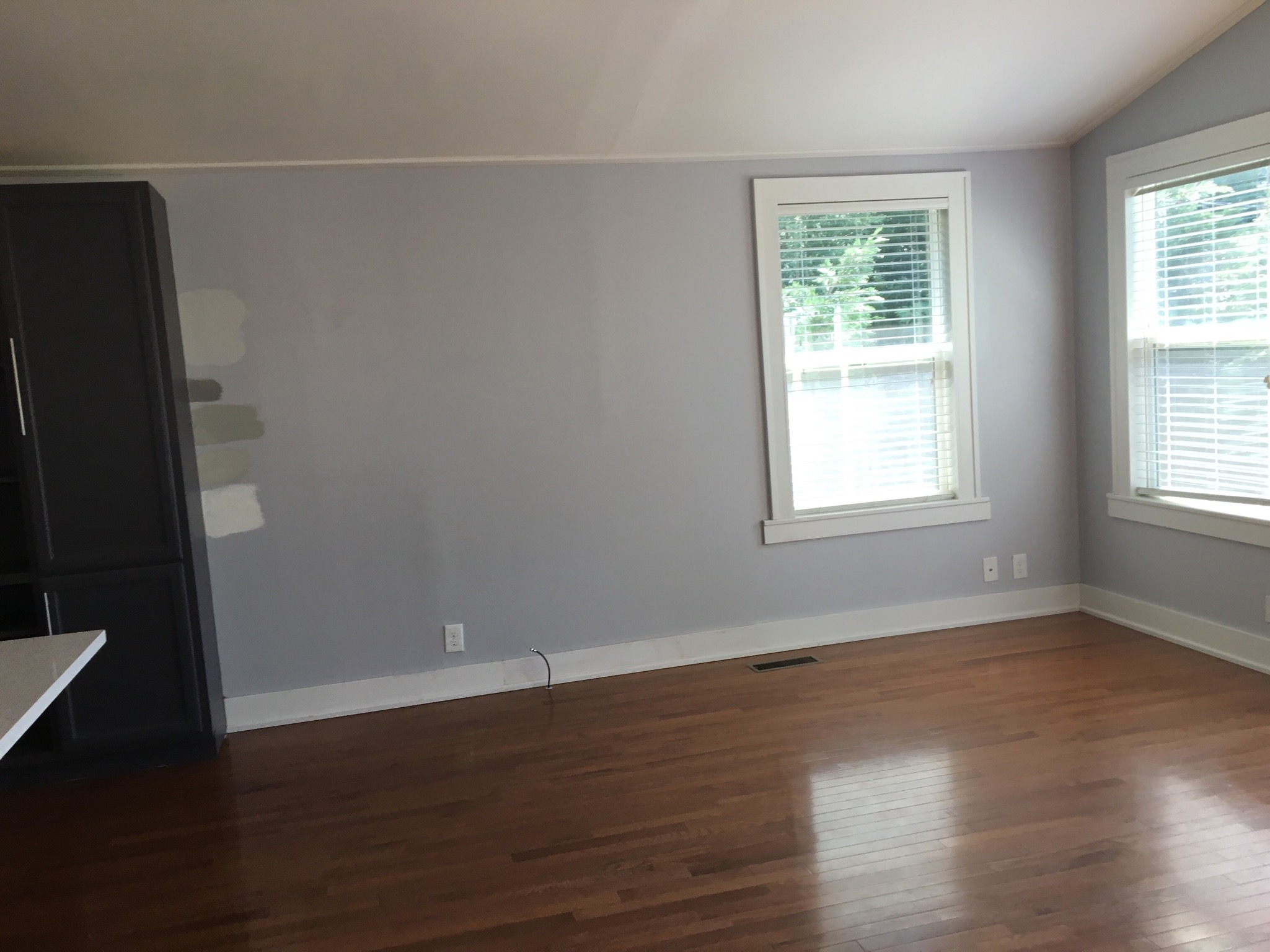
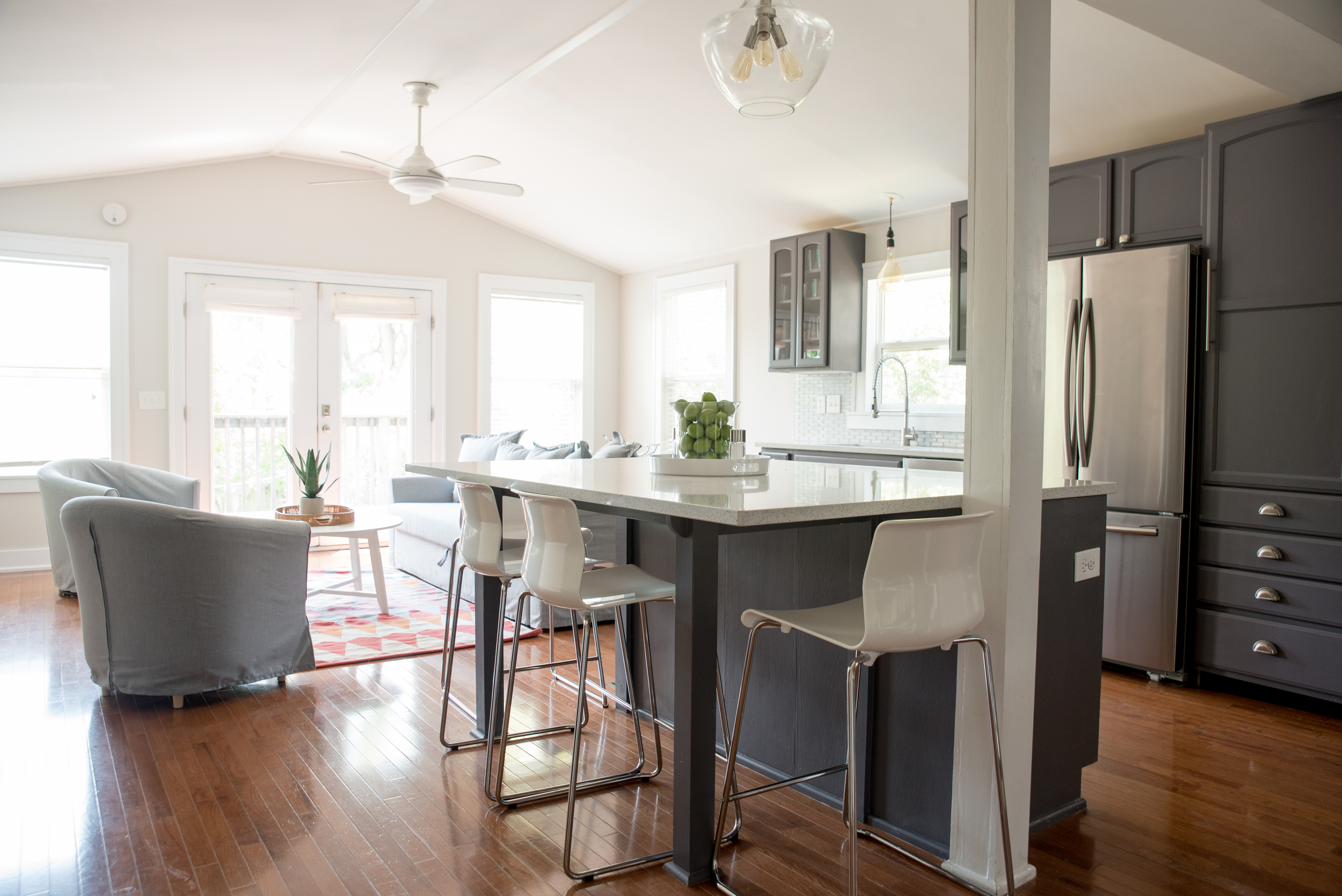
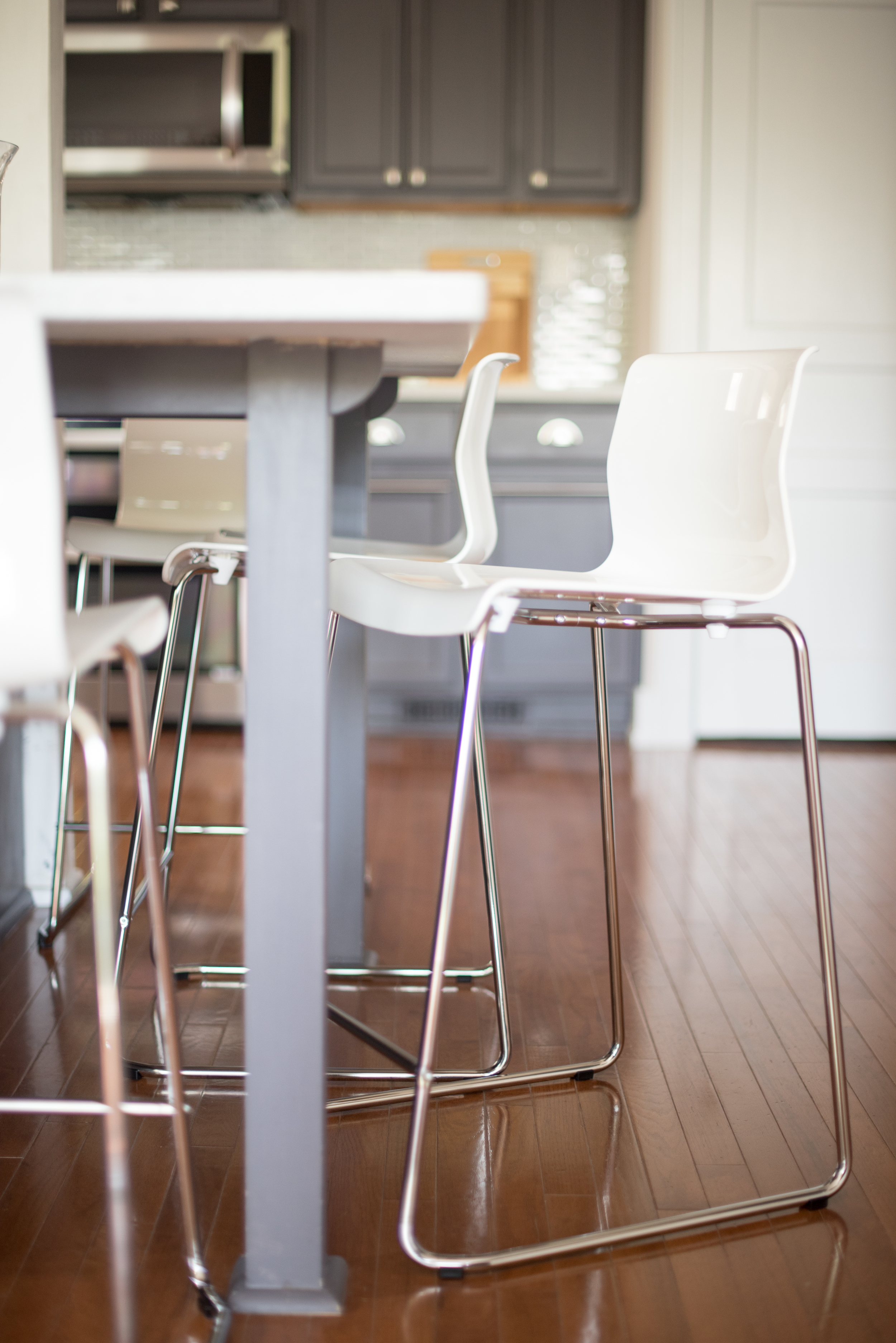
the old kitchen was open to one of the living areas, but also completely closed off by the positioning of the peninsula, not to mention the cabinets were totally outdated.

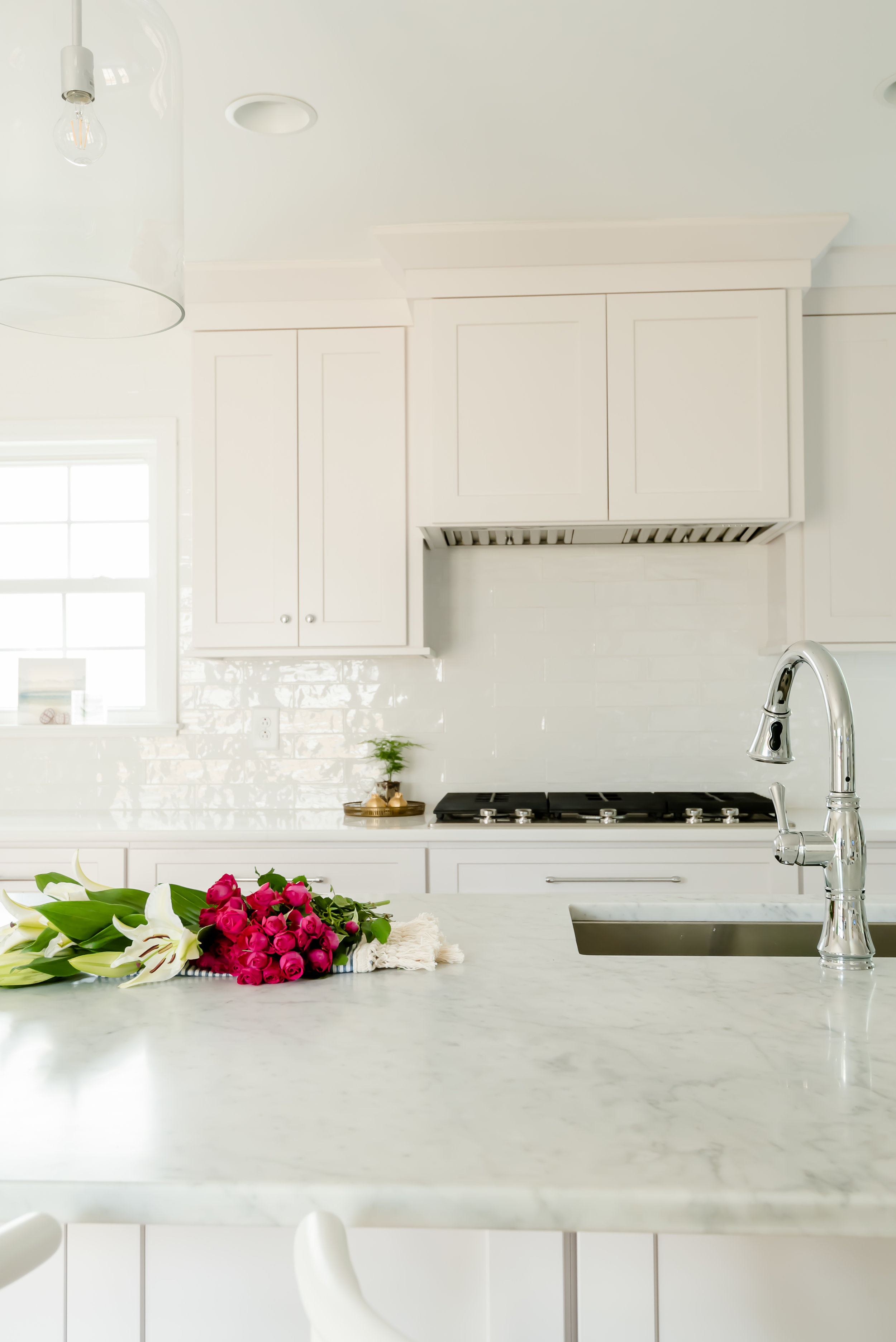
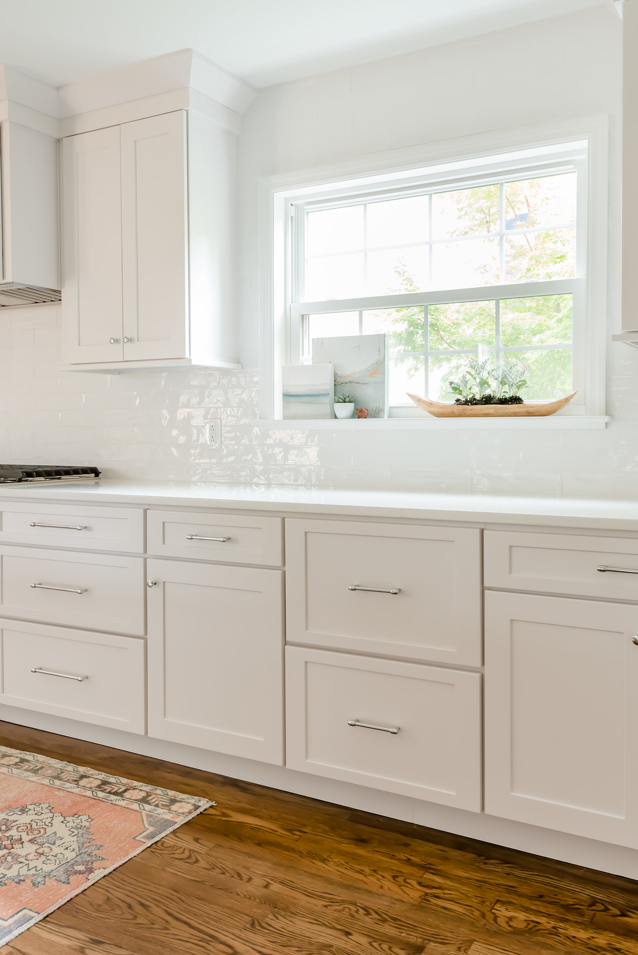
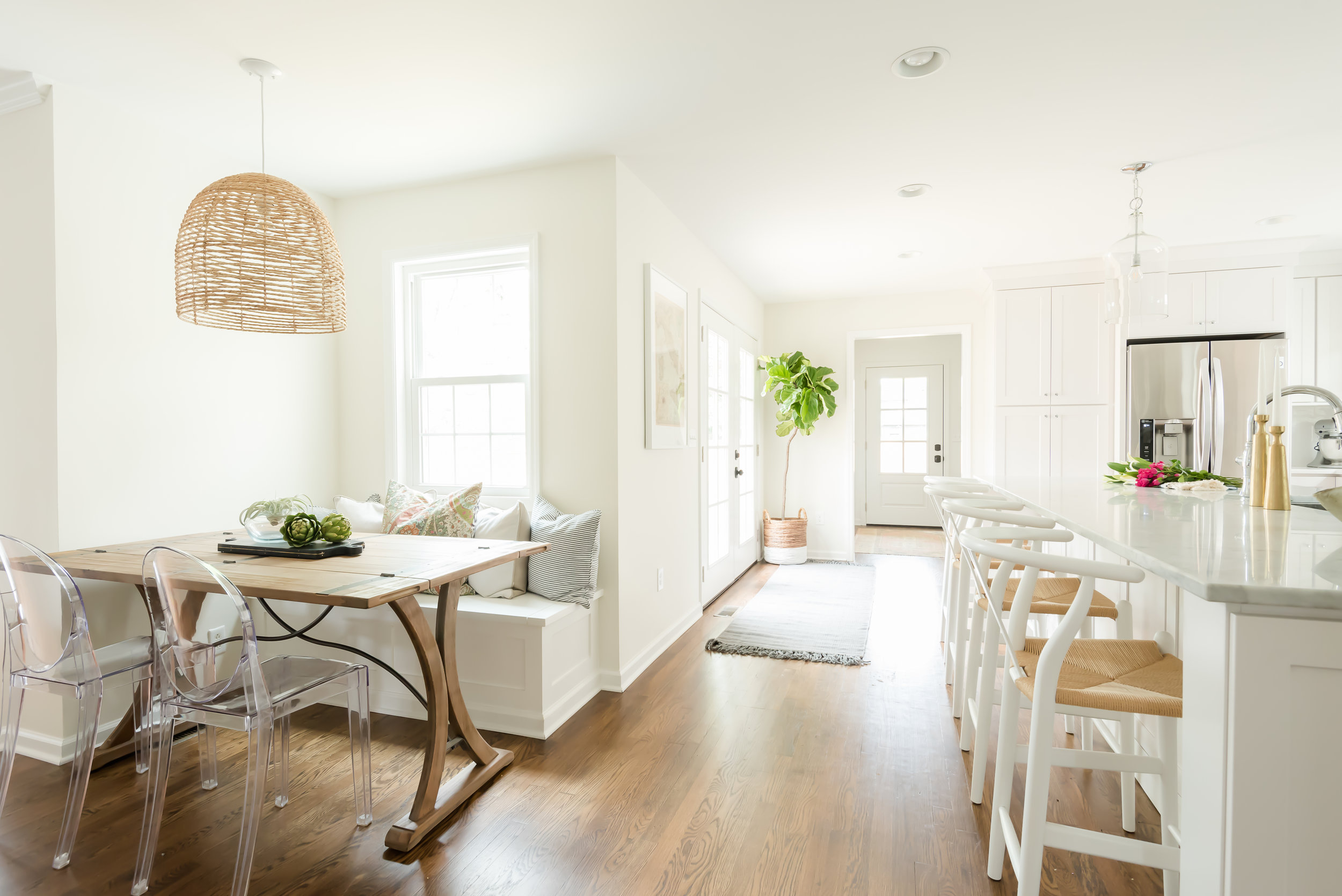
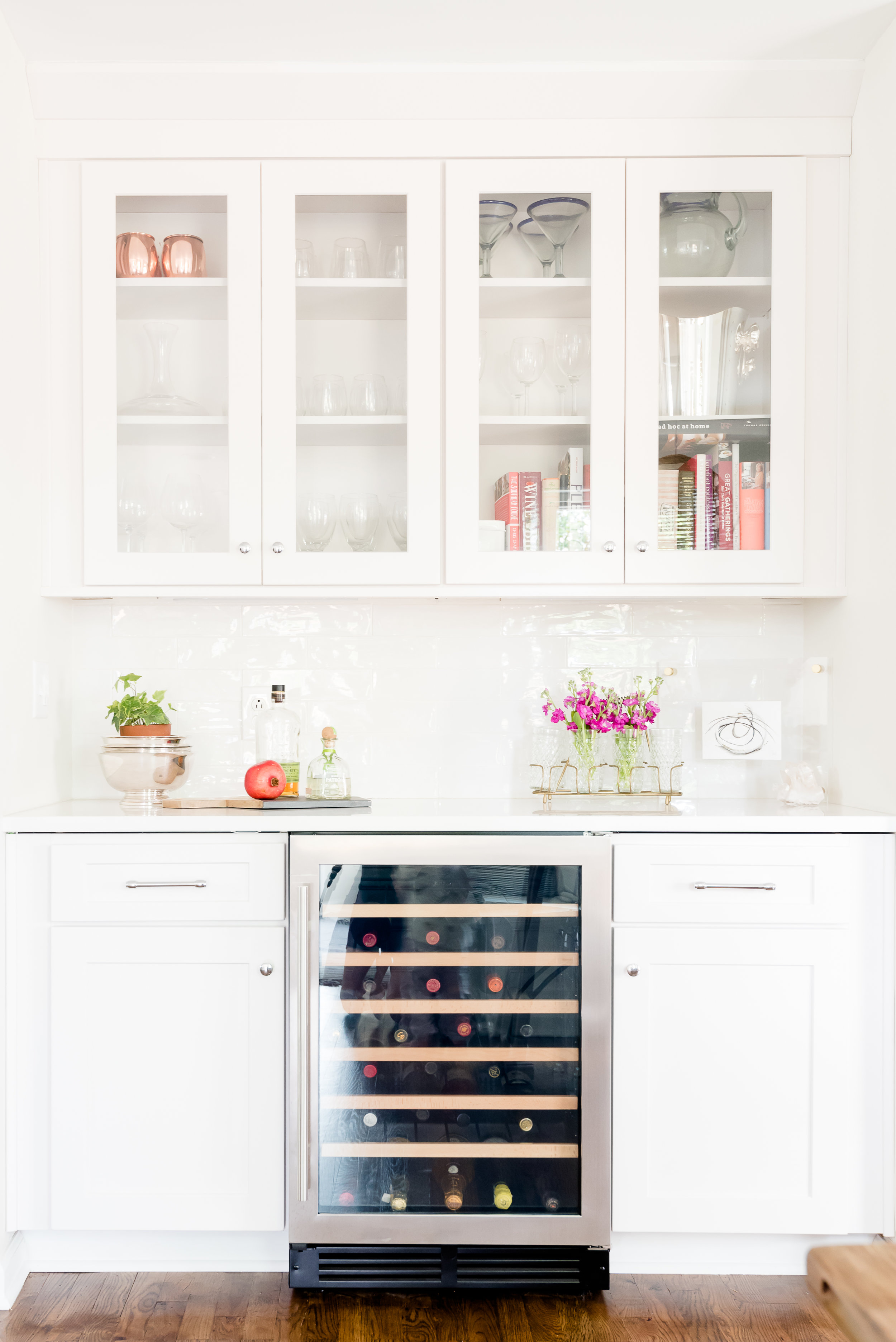
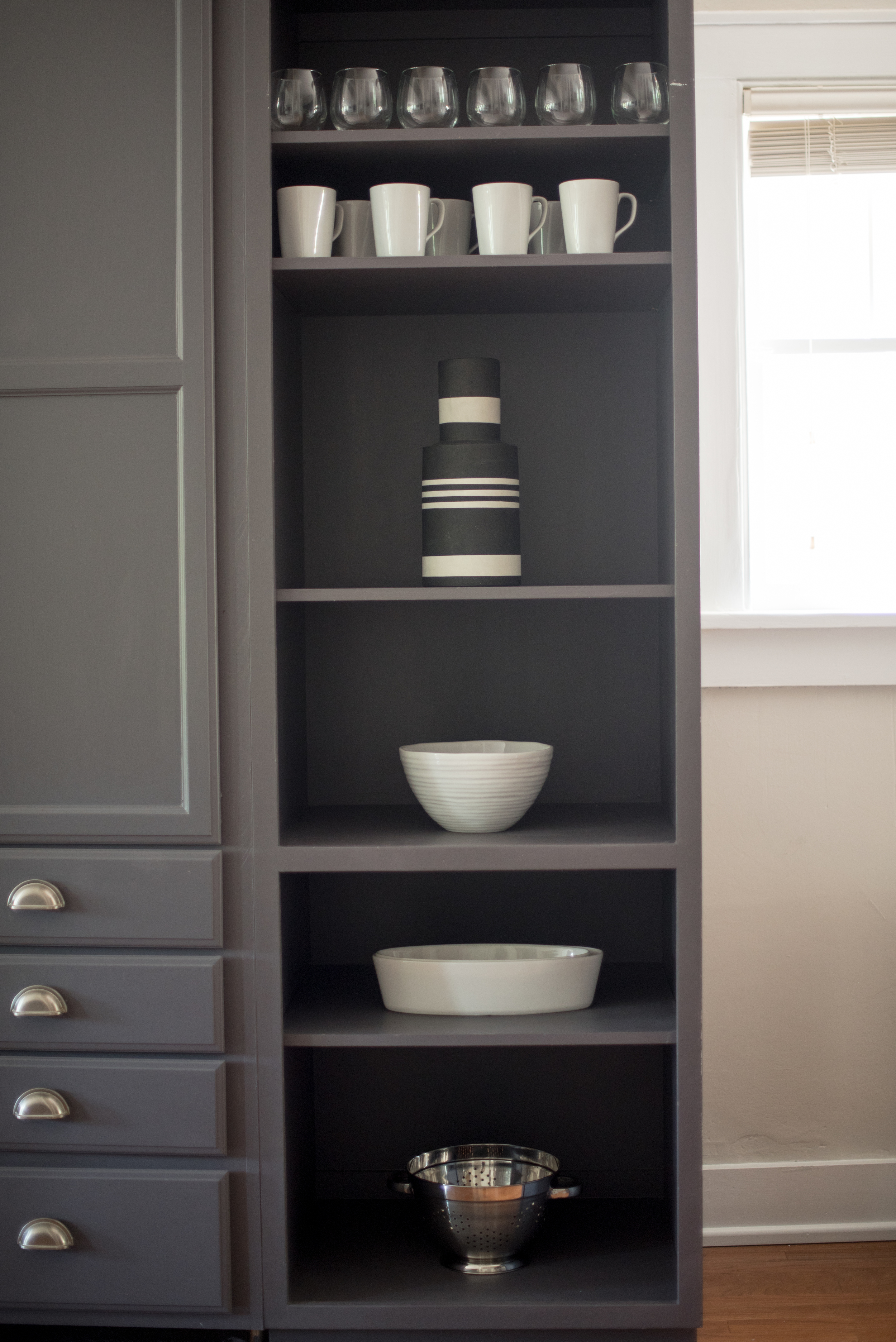
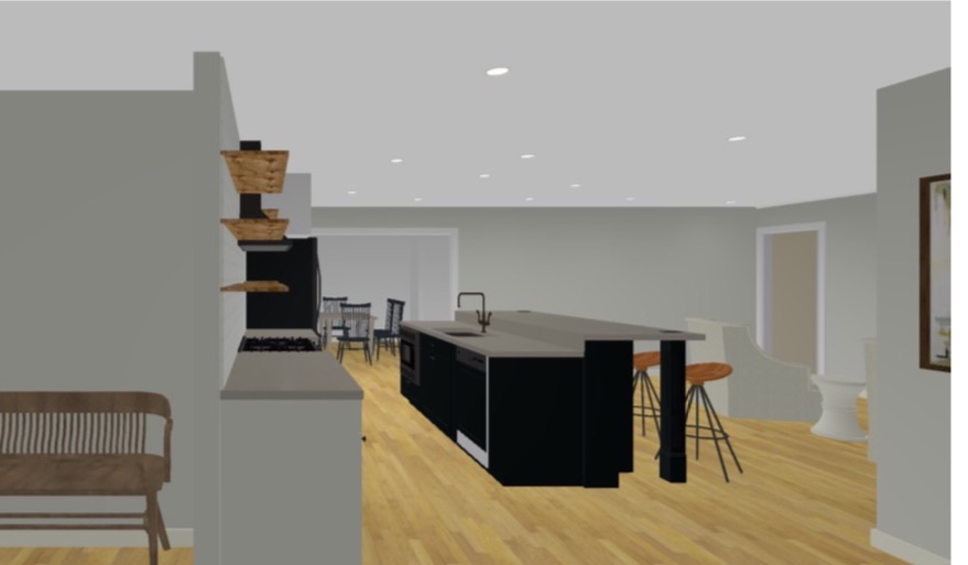
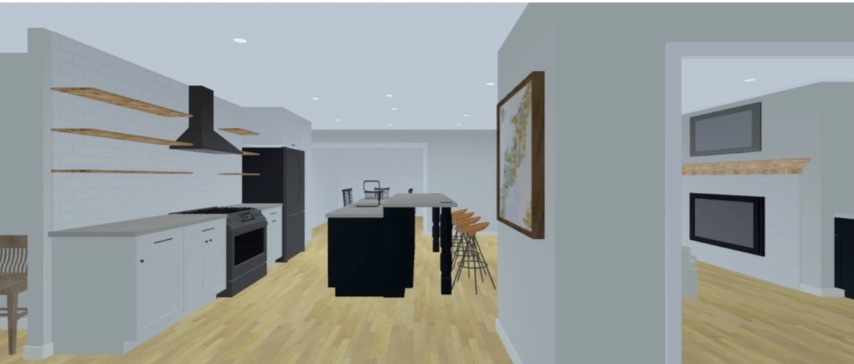
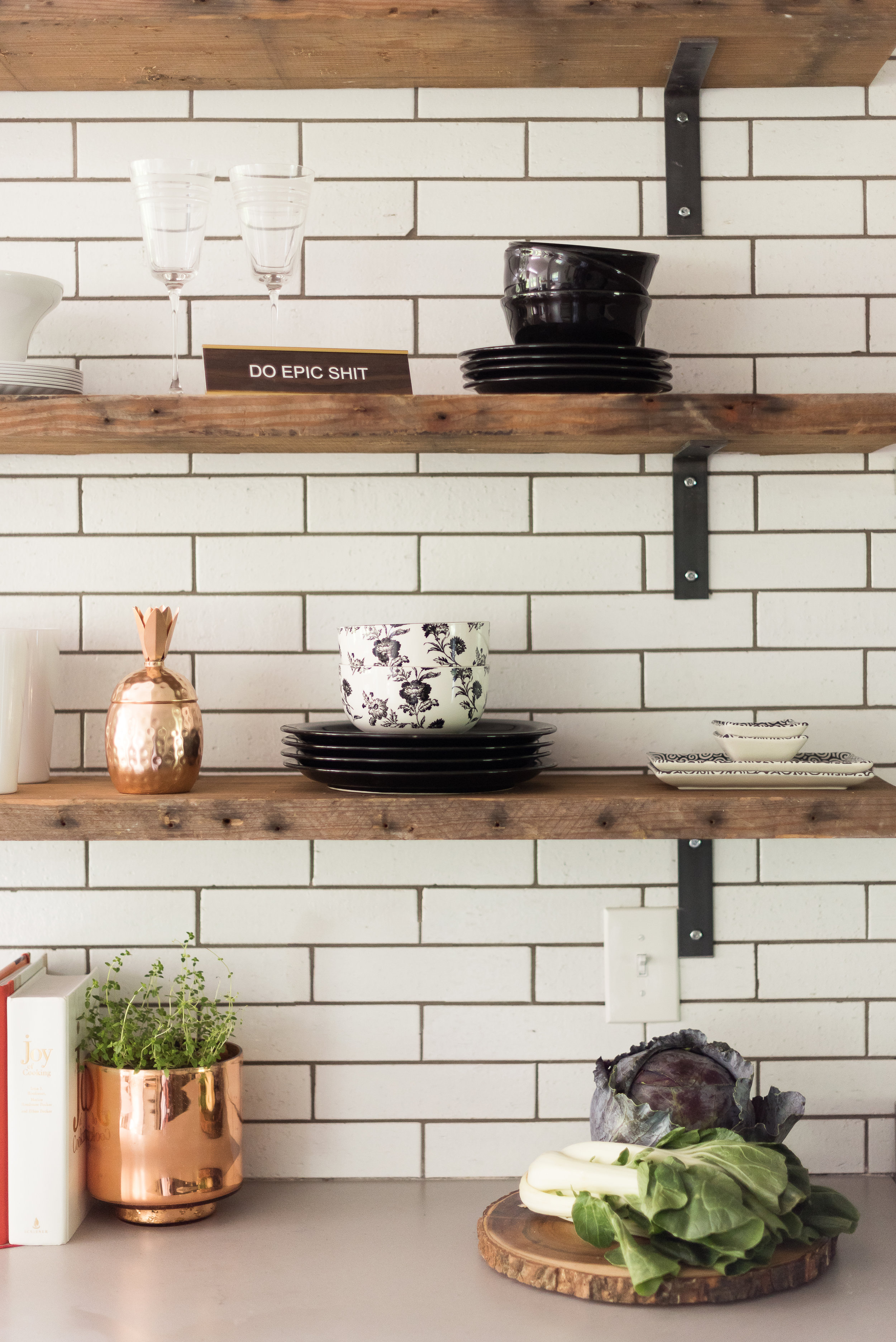
all of the upper cabinets came down and were replaced with open shelving used from salvaged wood and handmade industrial strength l brackets. the old island they had floating near the fridge in this picture has been painted and is now used in the dining room as a buffet for additional storage.

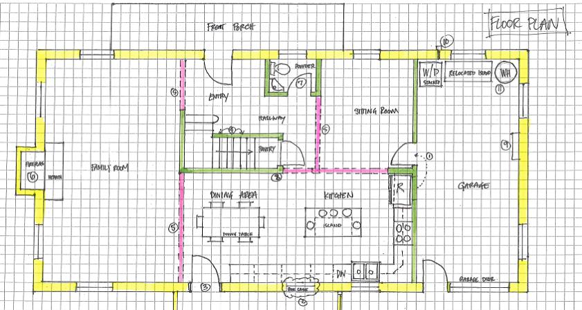
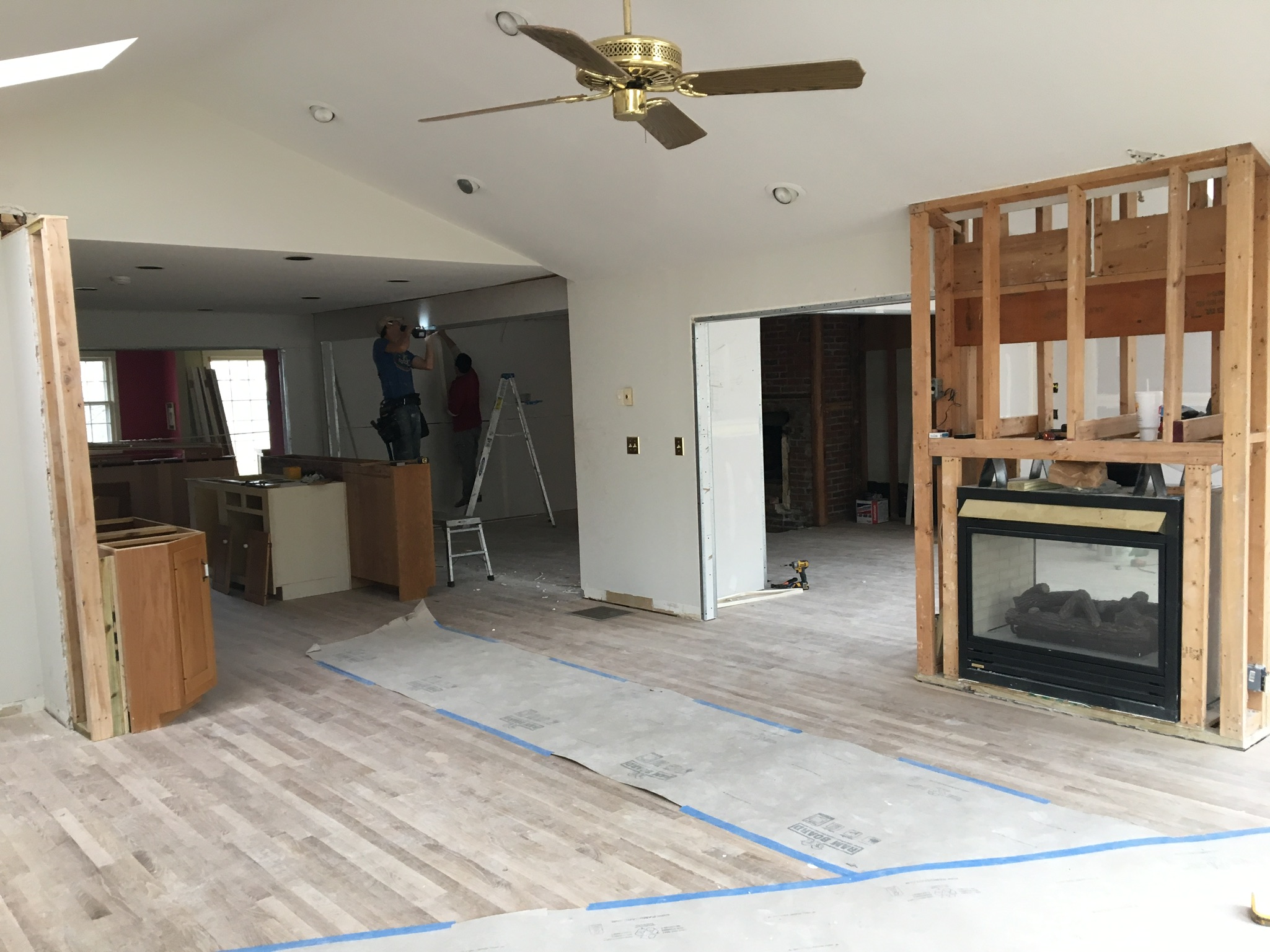
in order to make this work, we needed to take a wall down, open up the small doorway off of the kitchen that was currently there (to access the dining area) and reposition the peninsula to make it a true island (we literally sawed it off, and plopped it in the middle of the kitchen to use as the "new" island). not sure what is more satisfying than seeing a floor plan in real time....it turned out just how the clients and i envisioned it. so important for everyone involved to have a good floor plan from the get go.

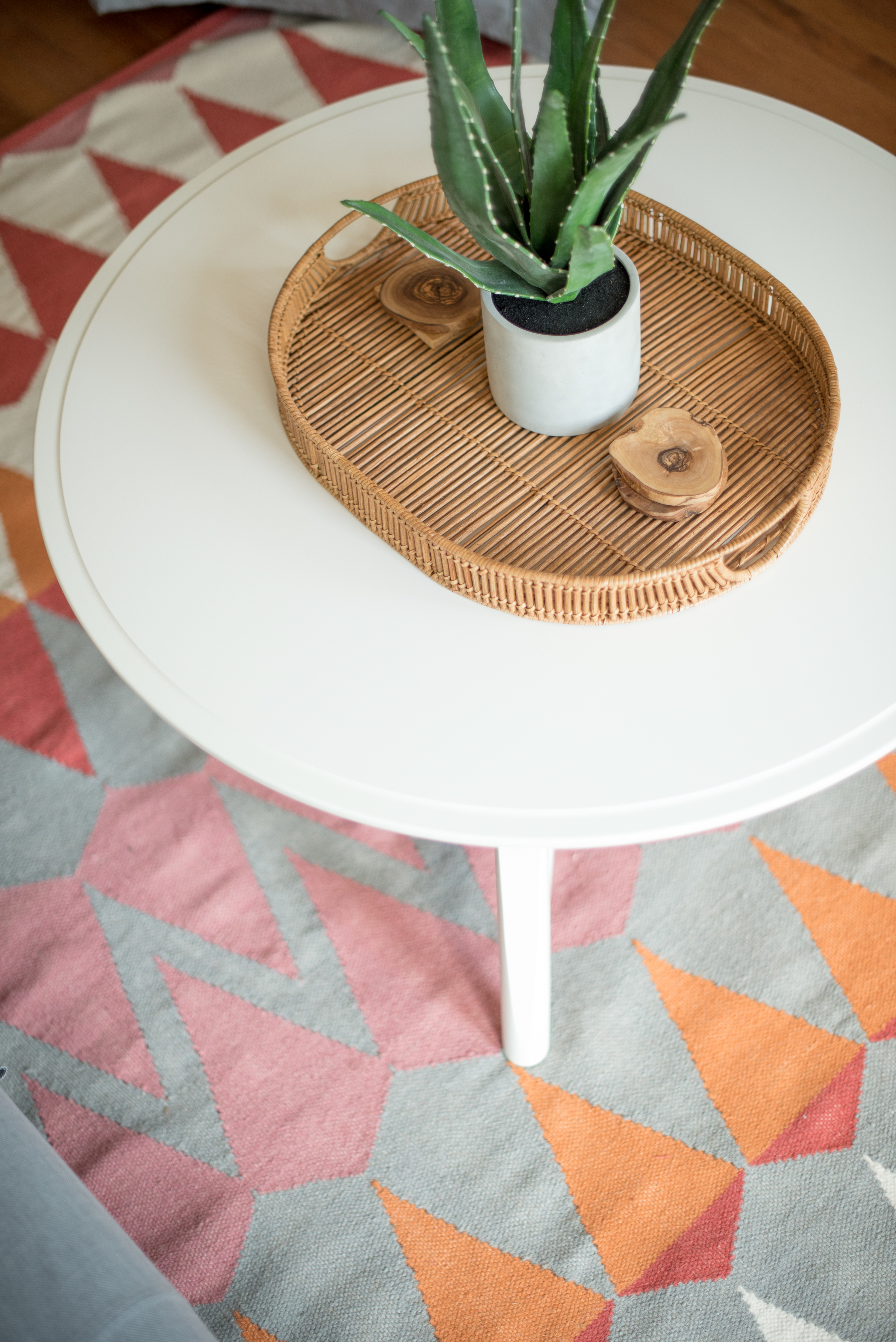
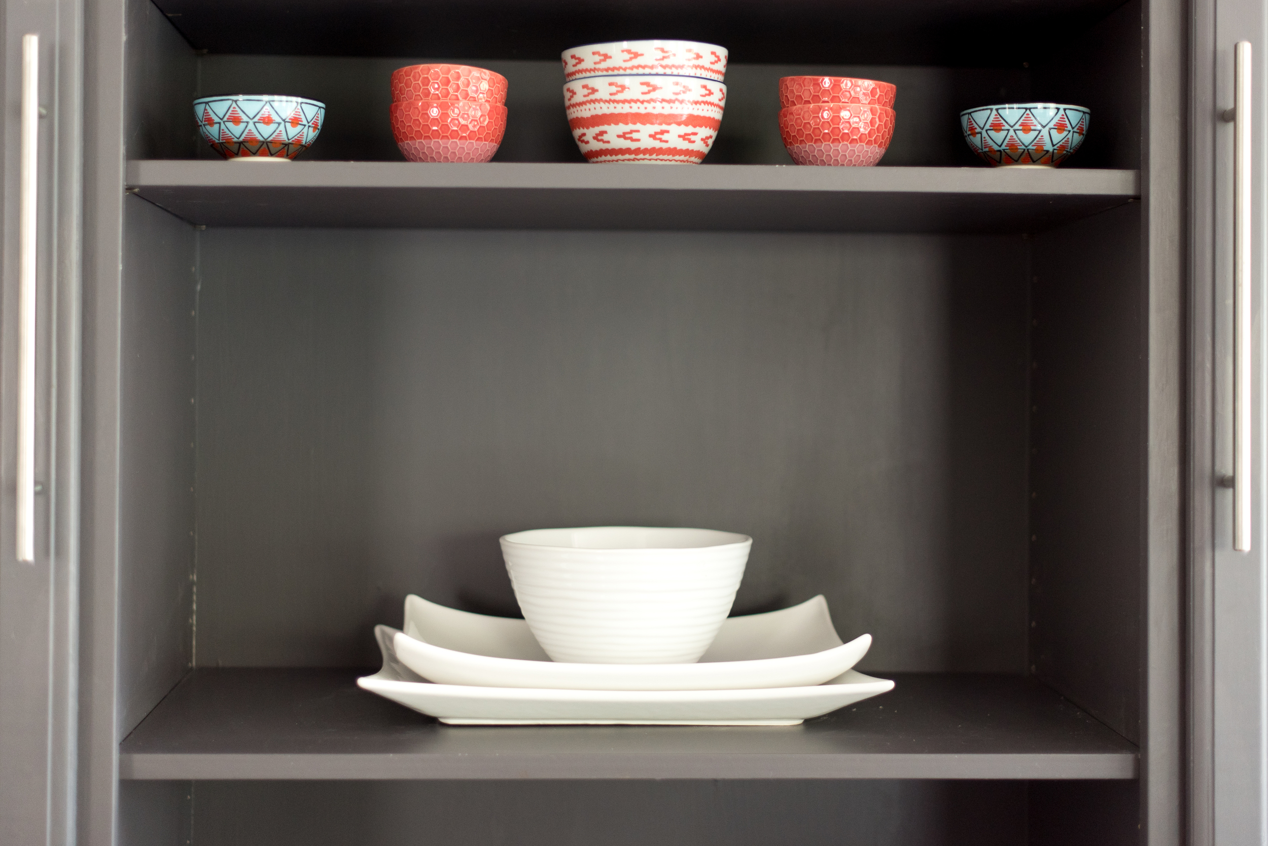
sources: we used caesarstone's quartz in raw concrete for all countertops. the dark base cabinets are benjamin moore's dragon's breath, and the lighter cabinets are revere pewter cut by 50%. we used a smattering of hardware in antique copper finishes. the backsplash tile came from buy floors direct. it has the effect of a hand thrown subway without the cost. all rugs are from apple & oak.

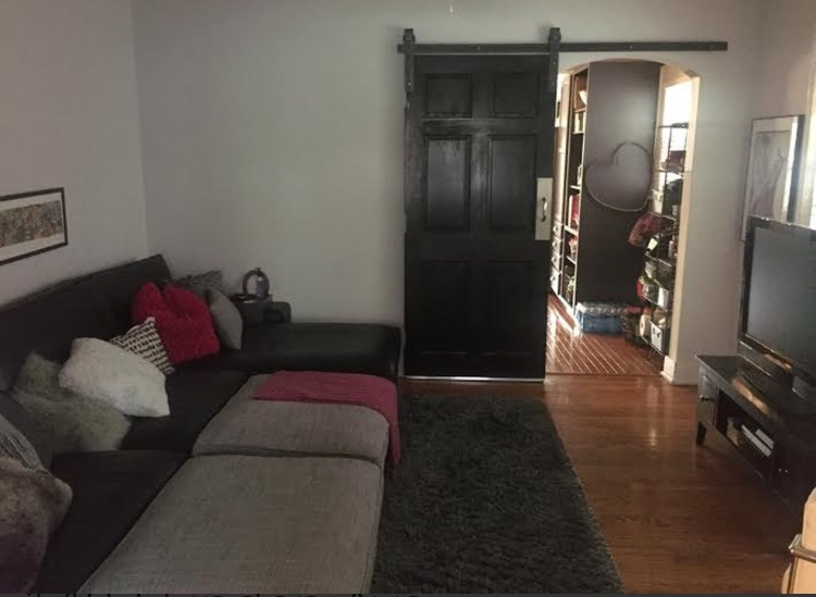
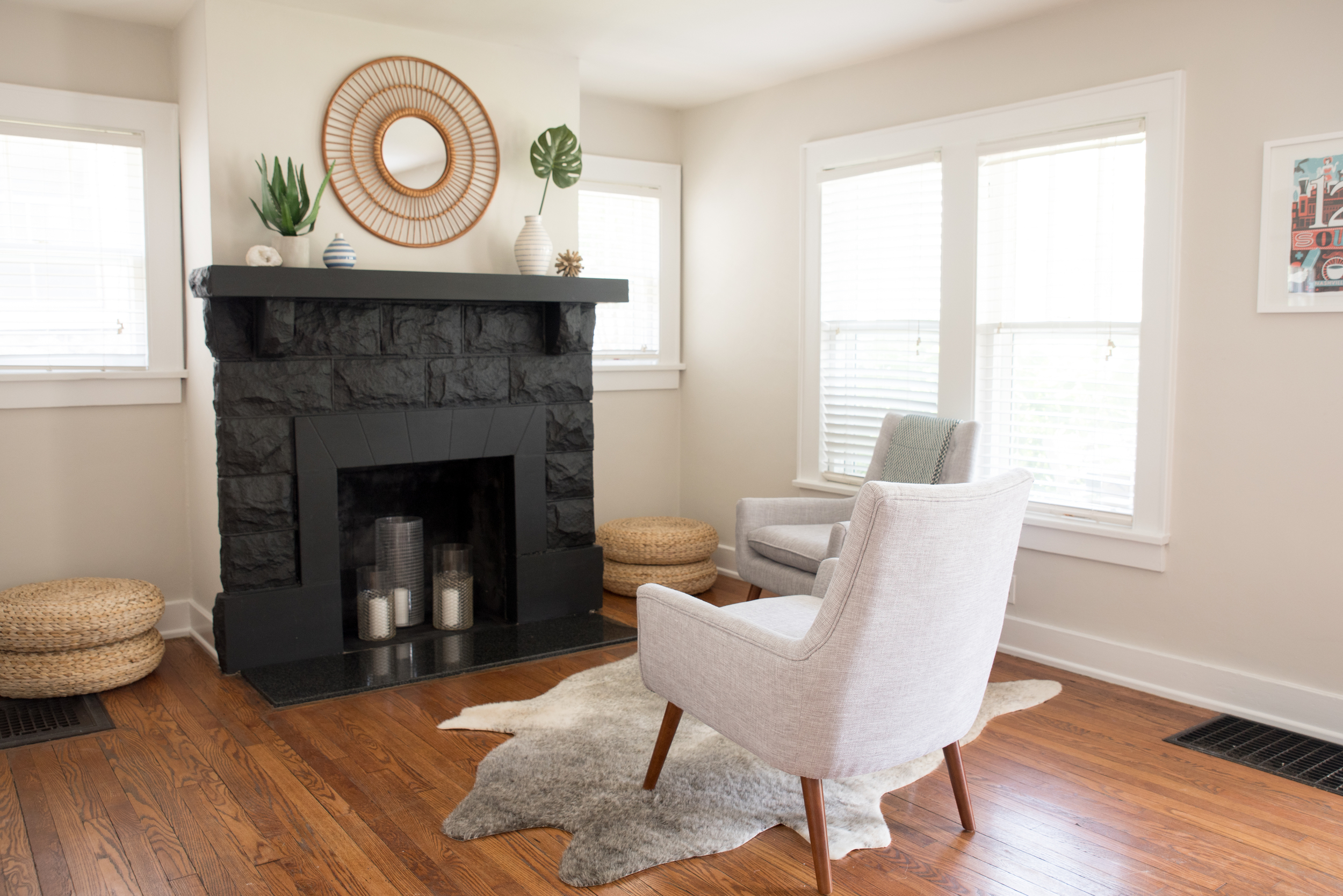
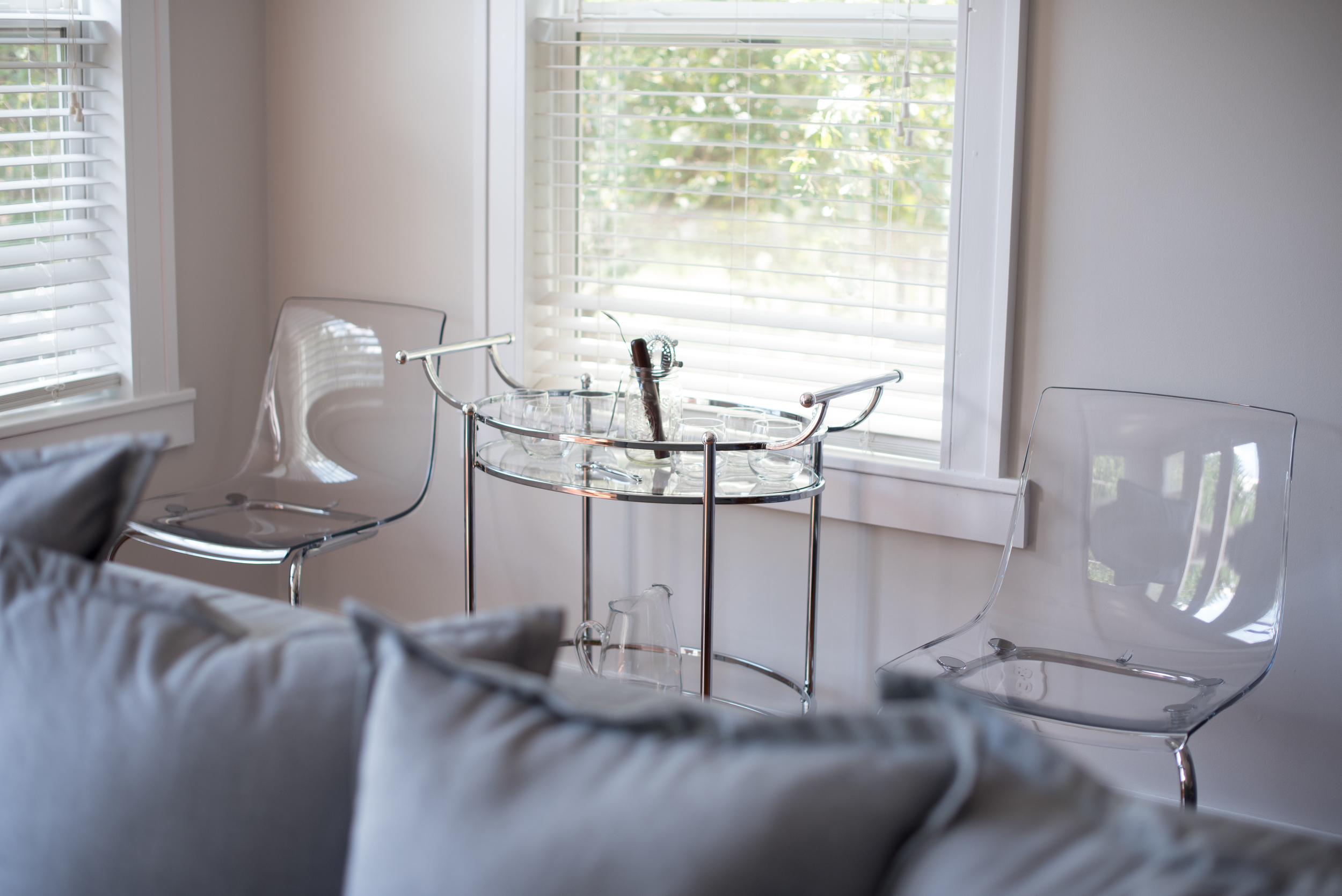
the bar & fireplace (the before and after)

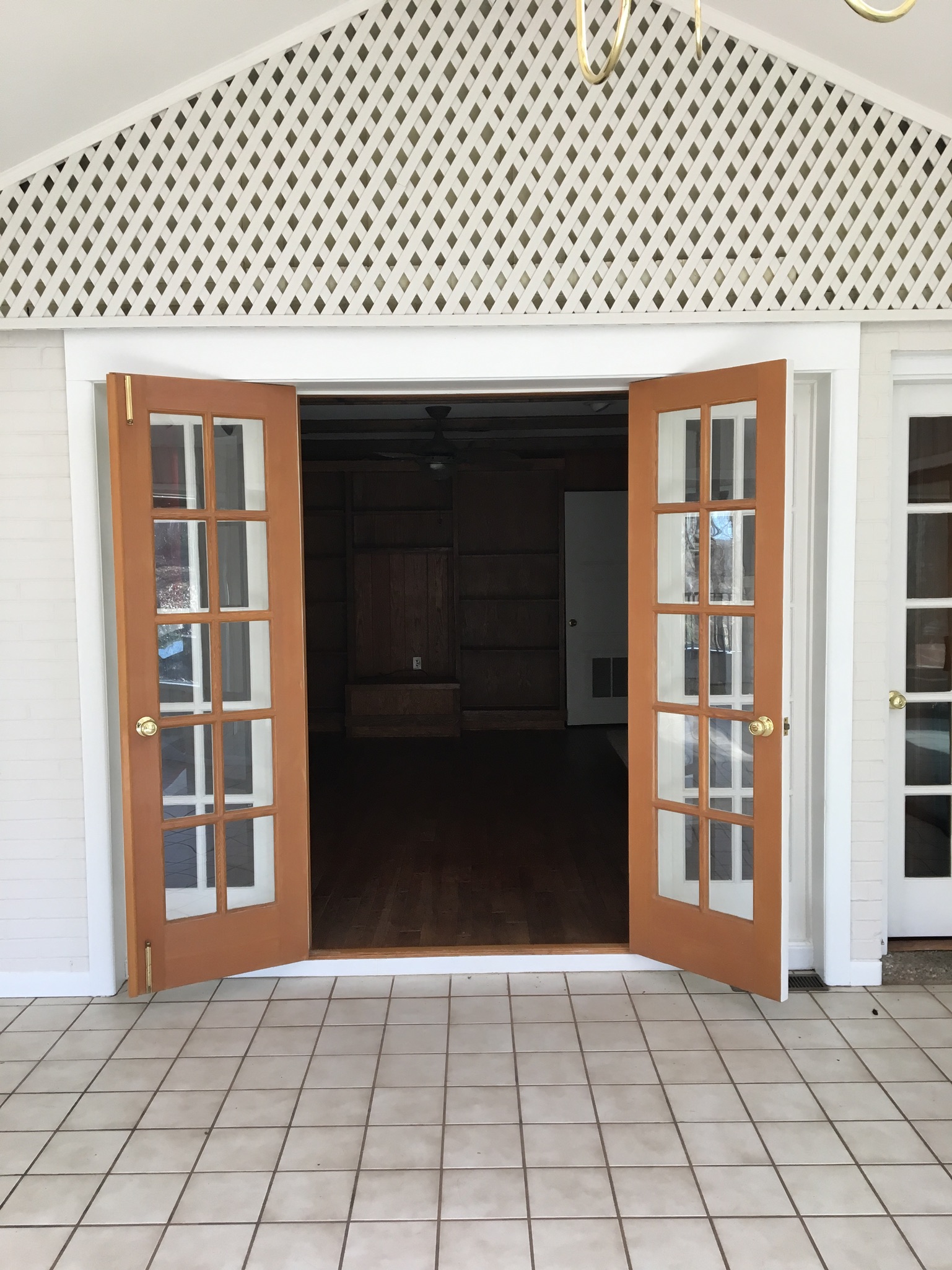
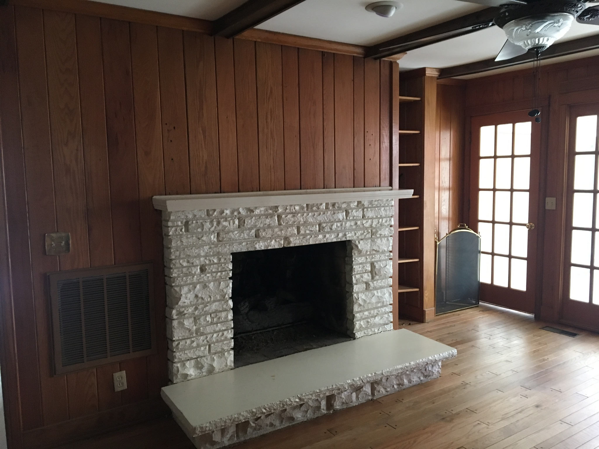
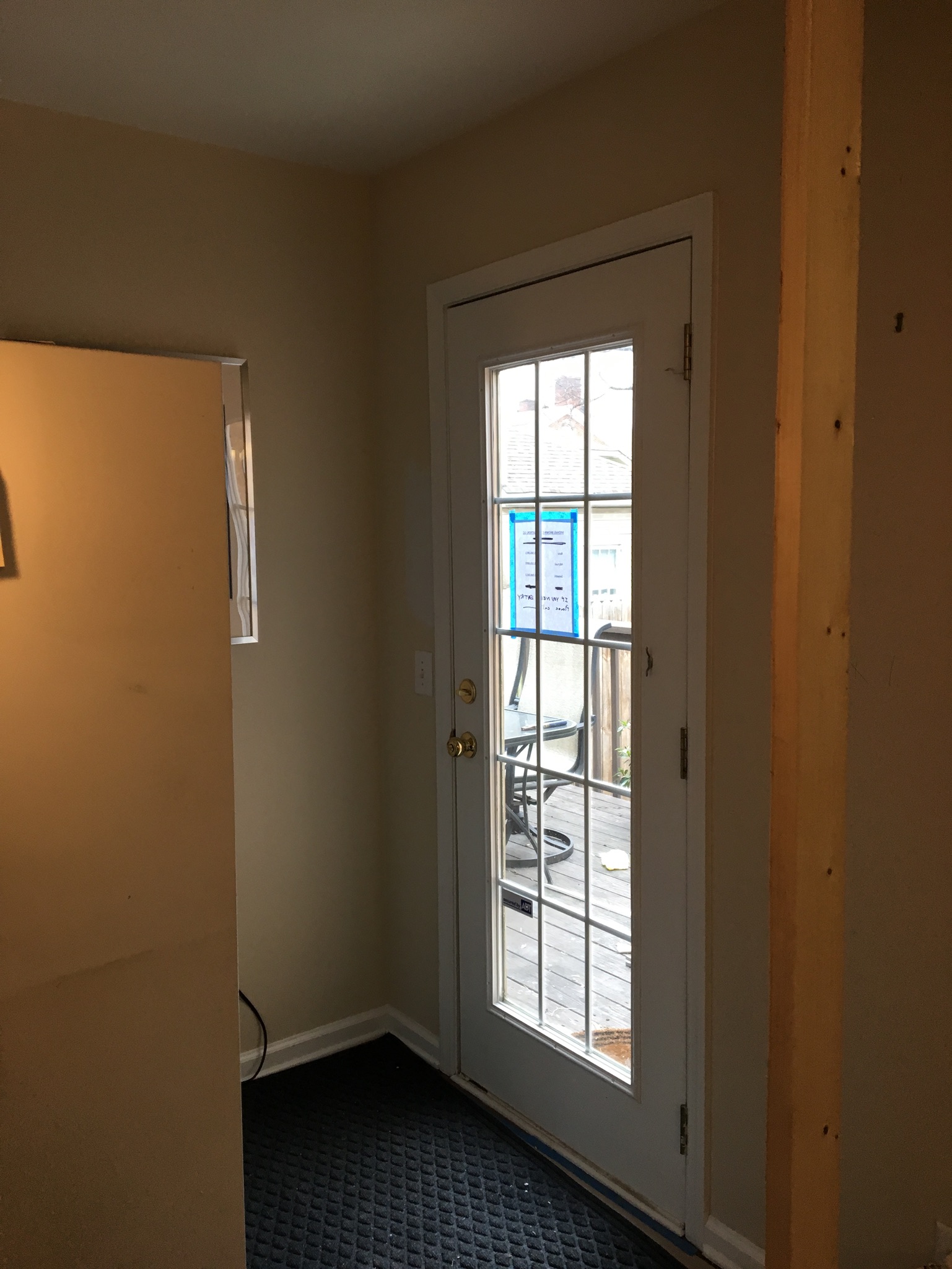
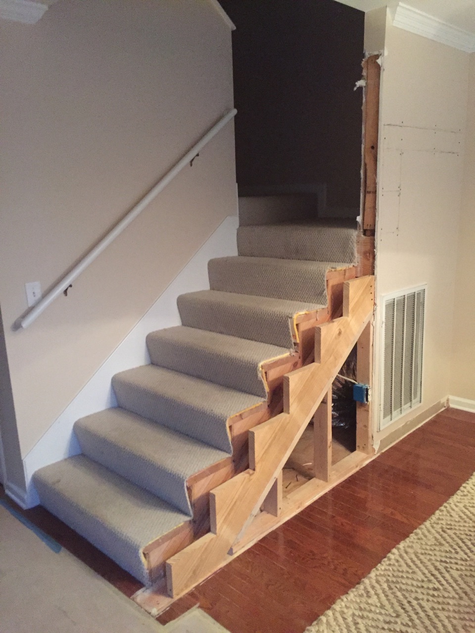
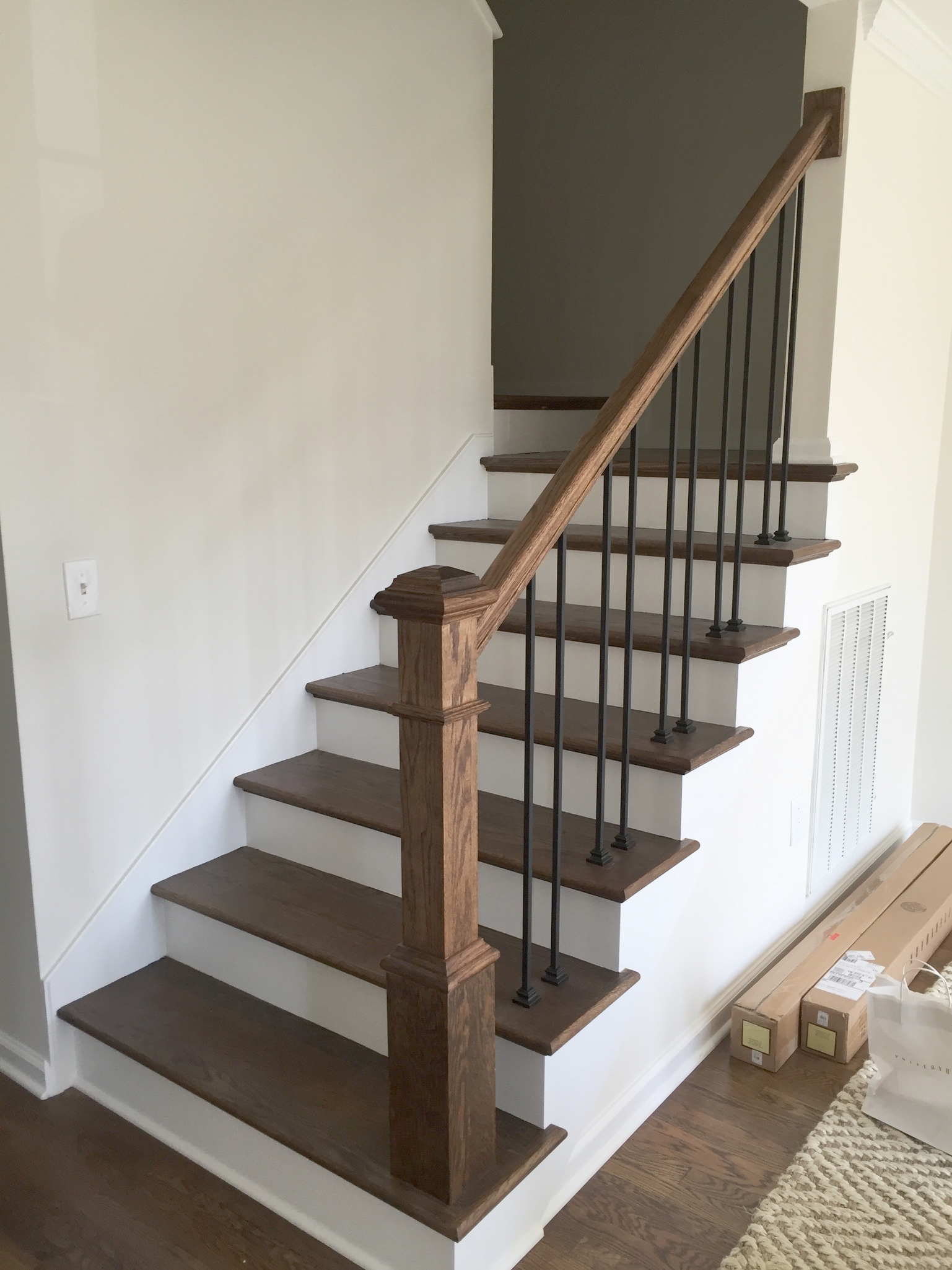
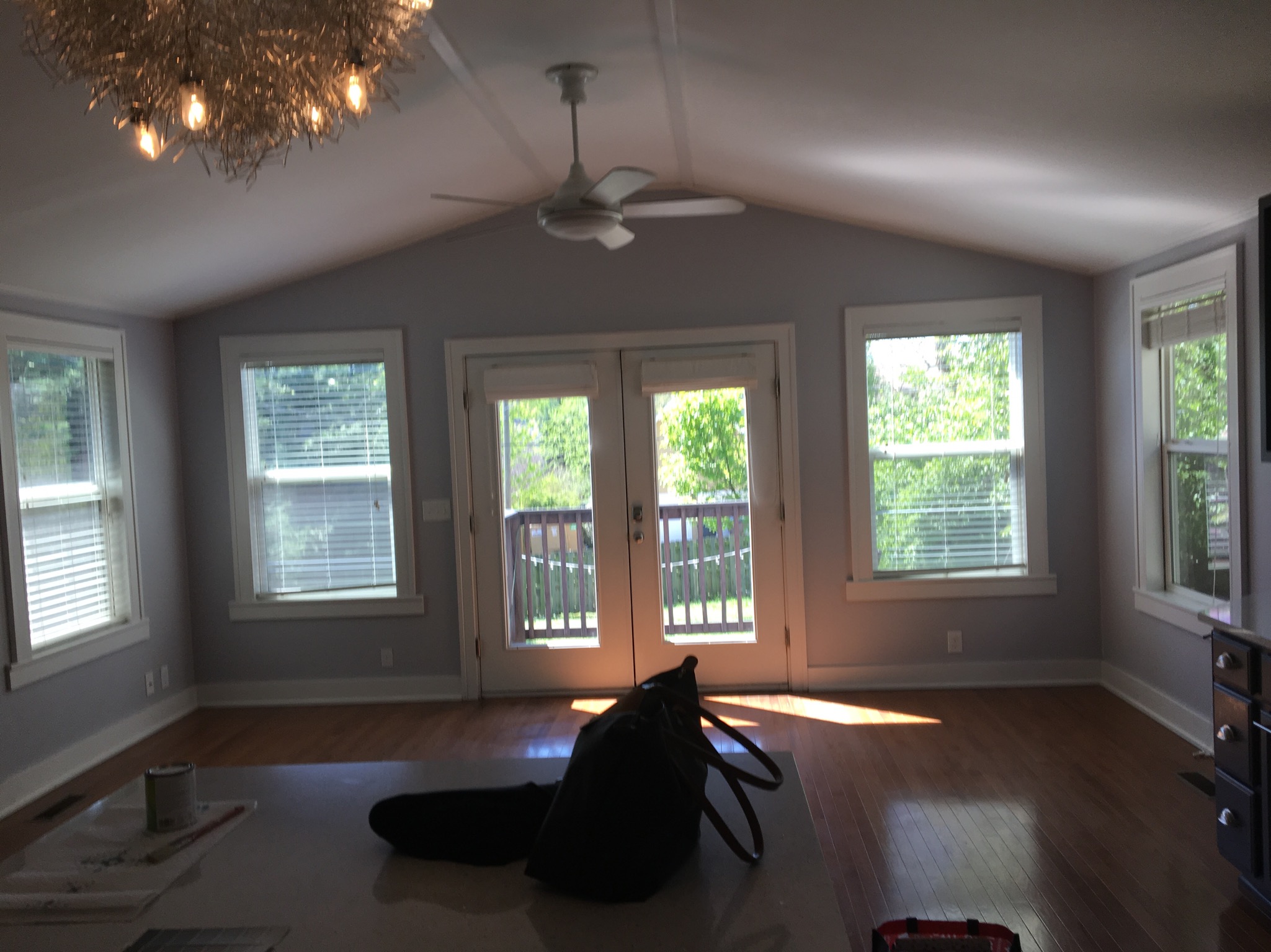
obviously, at one point in time, these french doors served as the back of the house. the previous owners had added on the new living space. first, we had to raise the floor and tear this wall down.

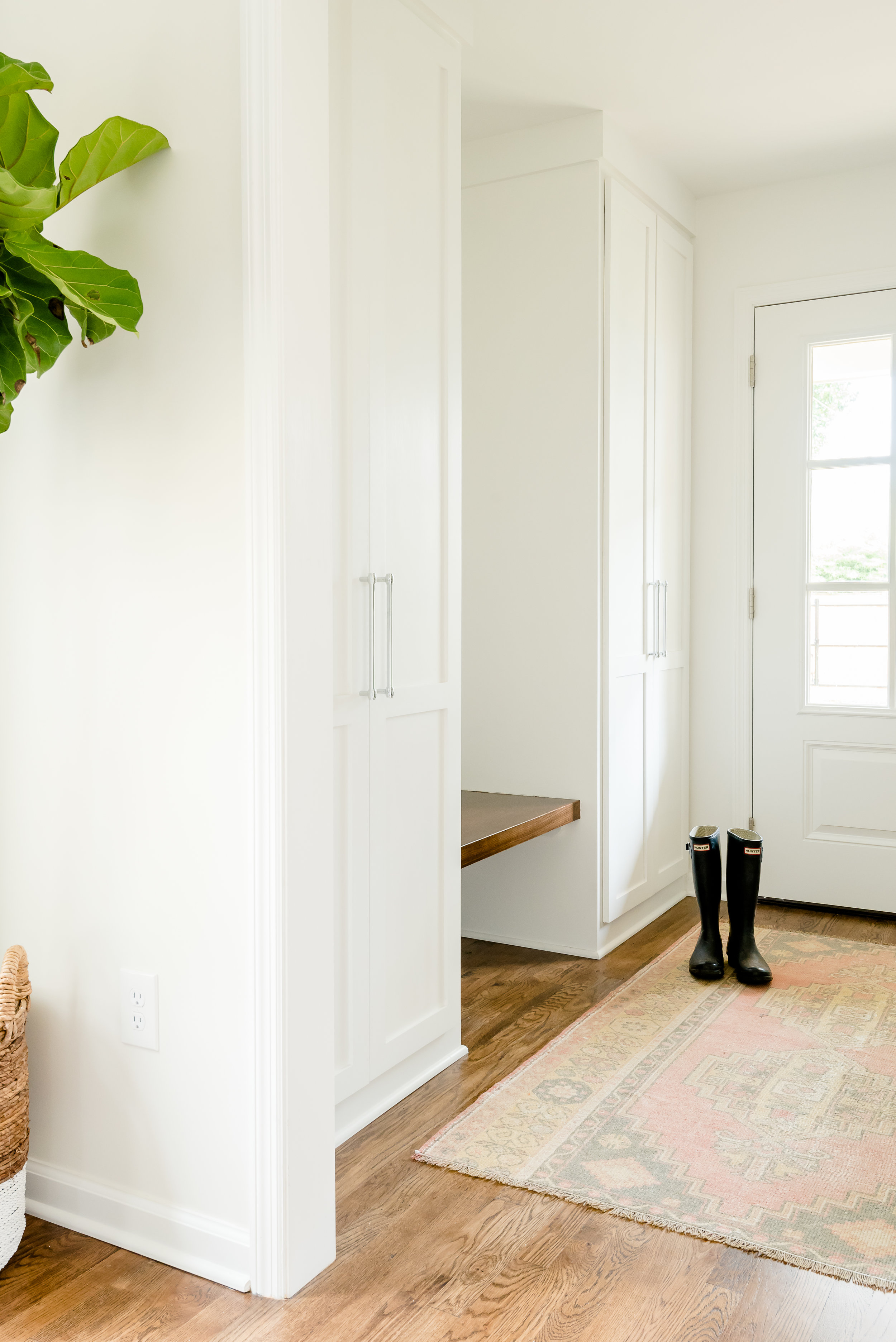
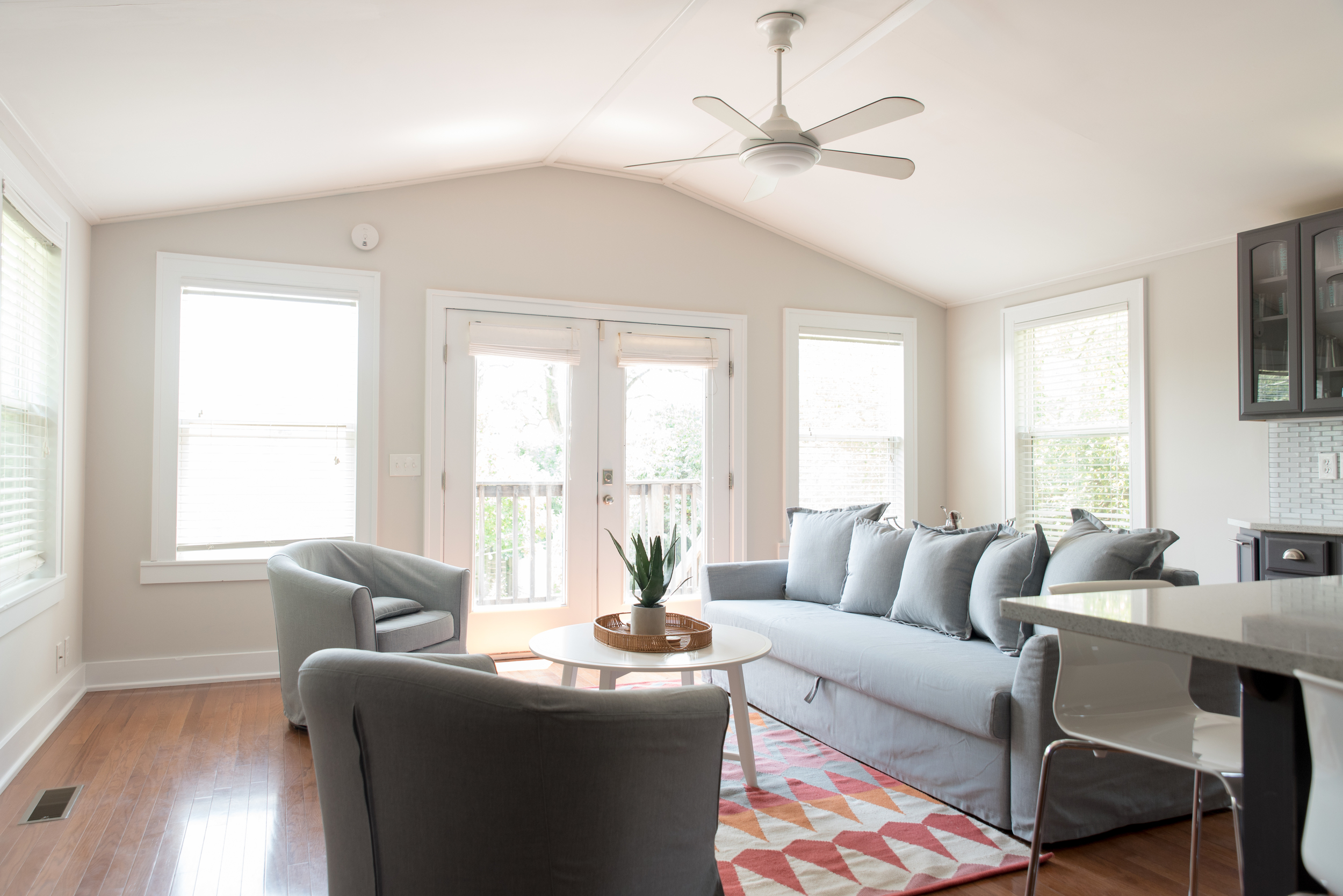
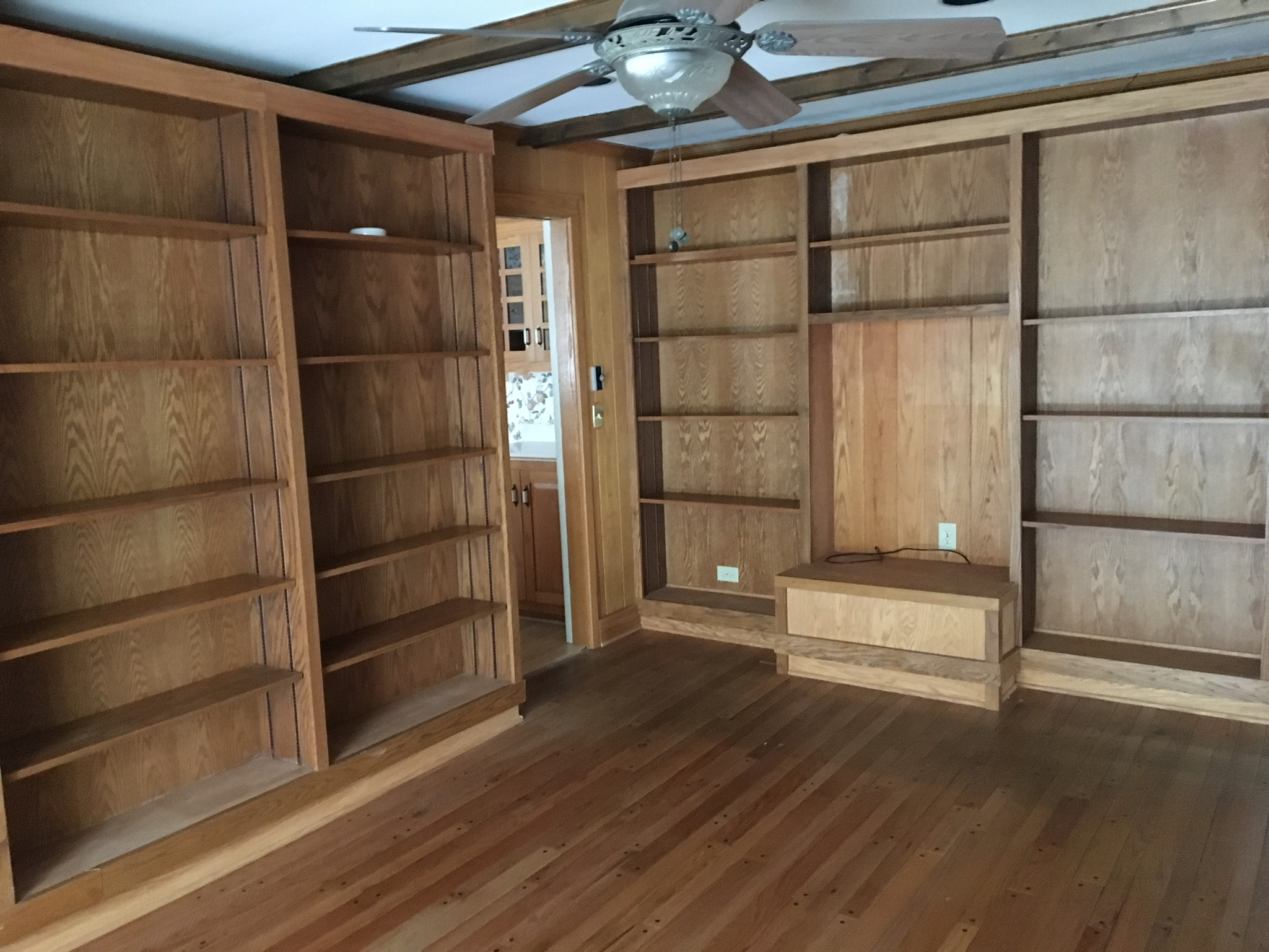
the entire room was encased in paneling and bookshelves. the shelves were actually great quality, so we ended up ripping them out of this room, painting them and moving them to the front of the house where we created an office for the new owner's, complete with these repurposed built-in bookcases. this allowed us to tear down ALL of the walls in this room so that it was completely open to the kitchen and both living areas.

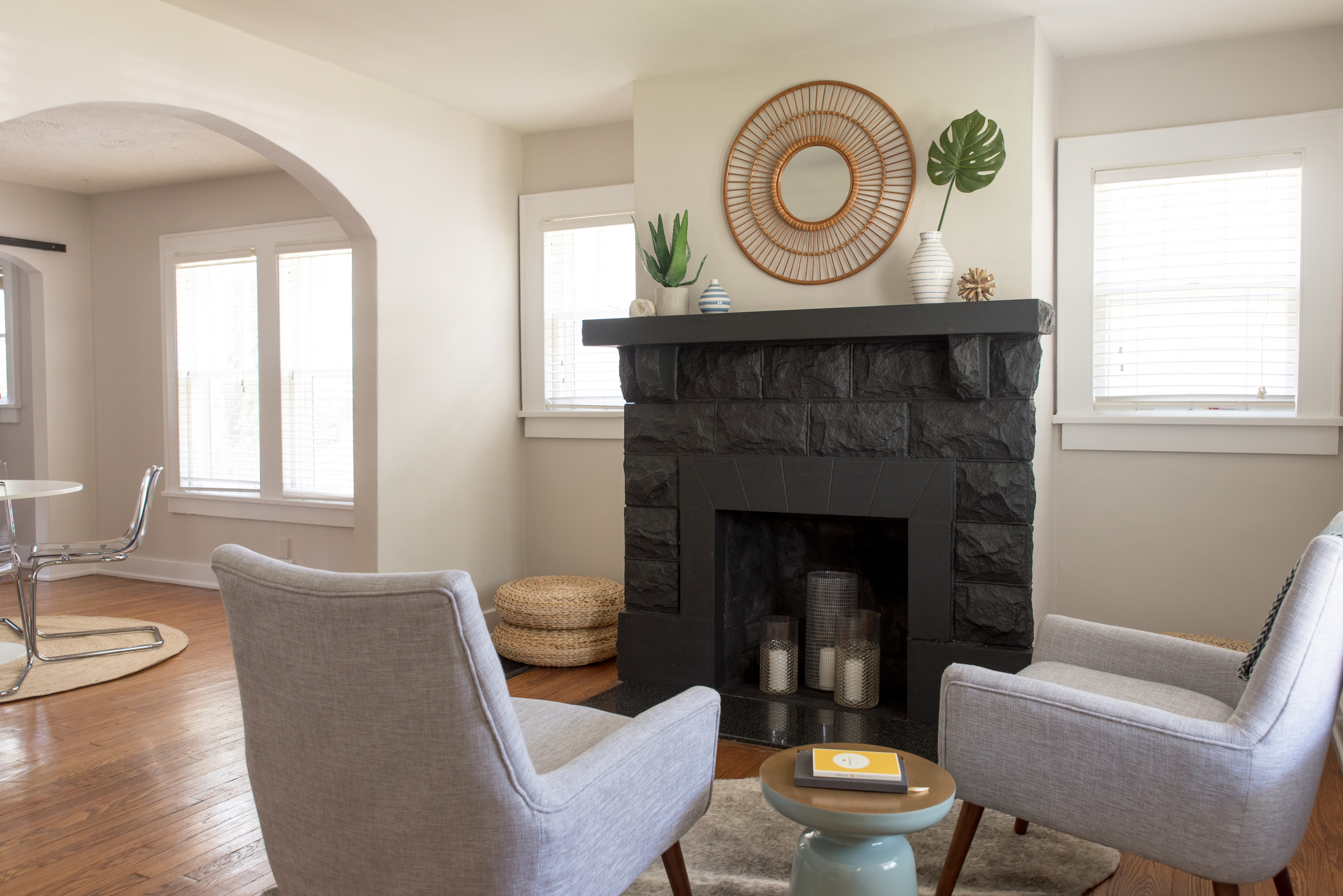
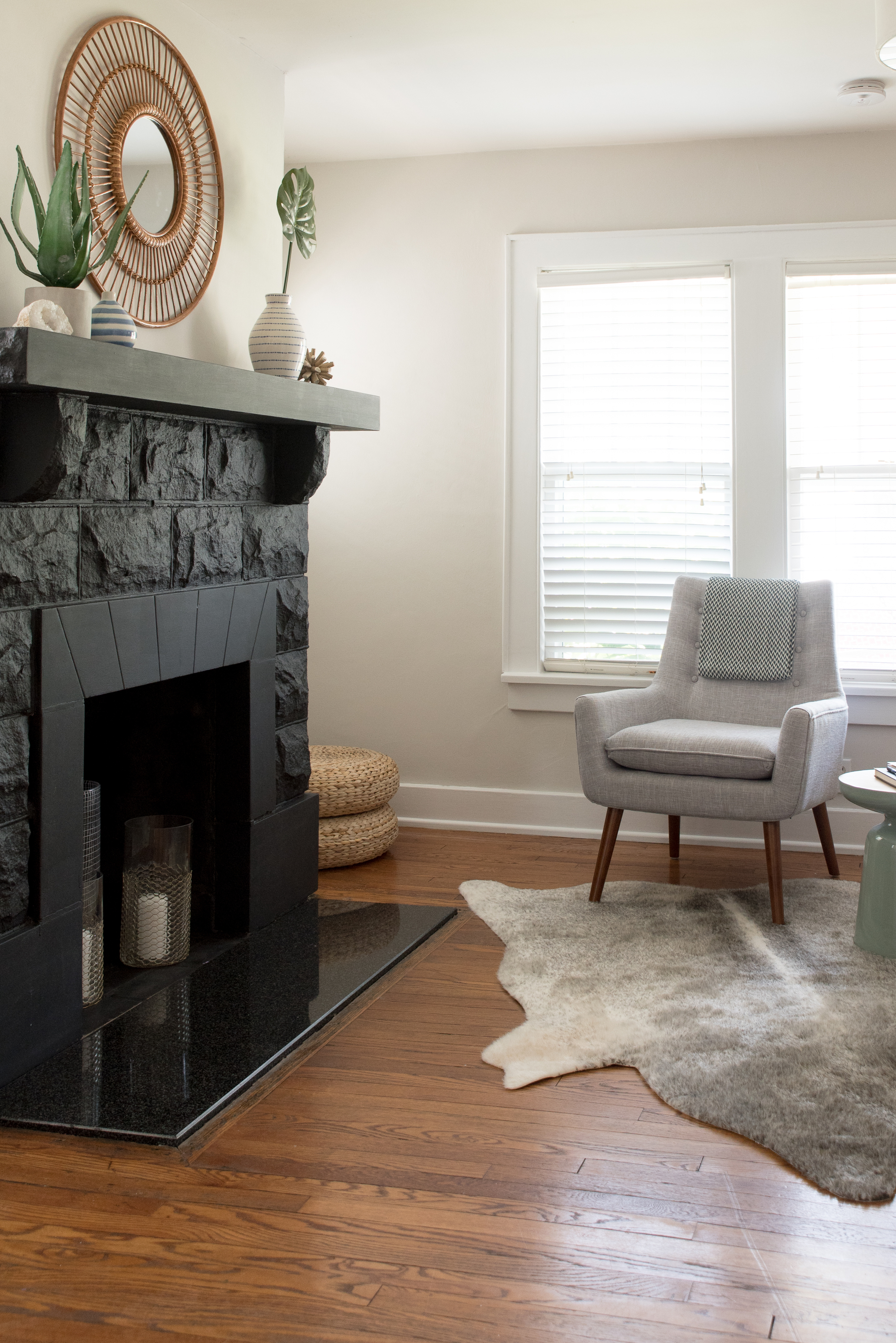
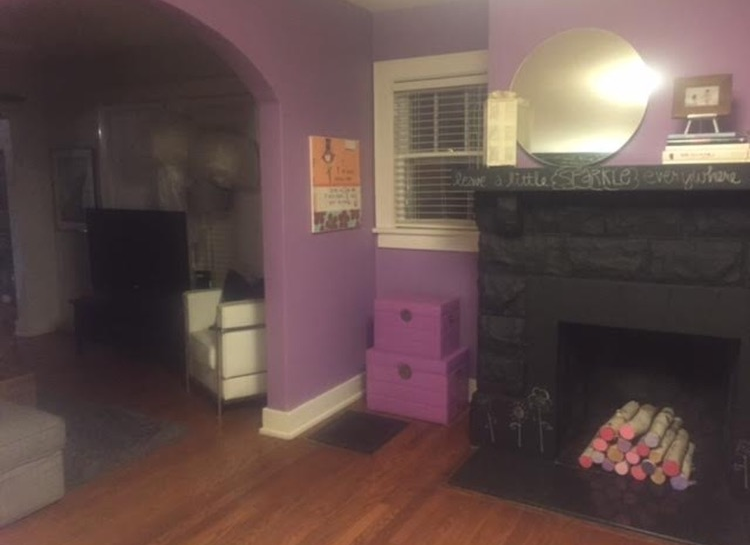
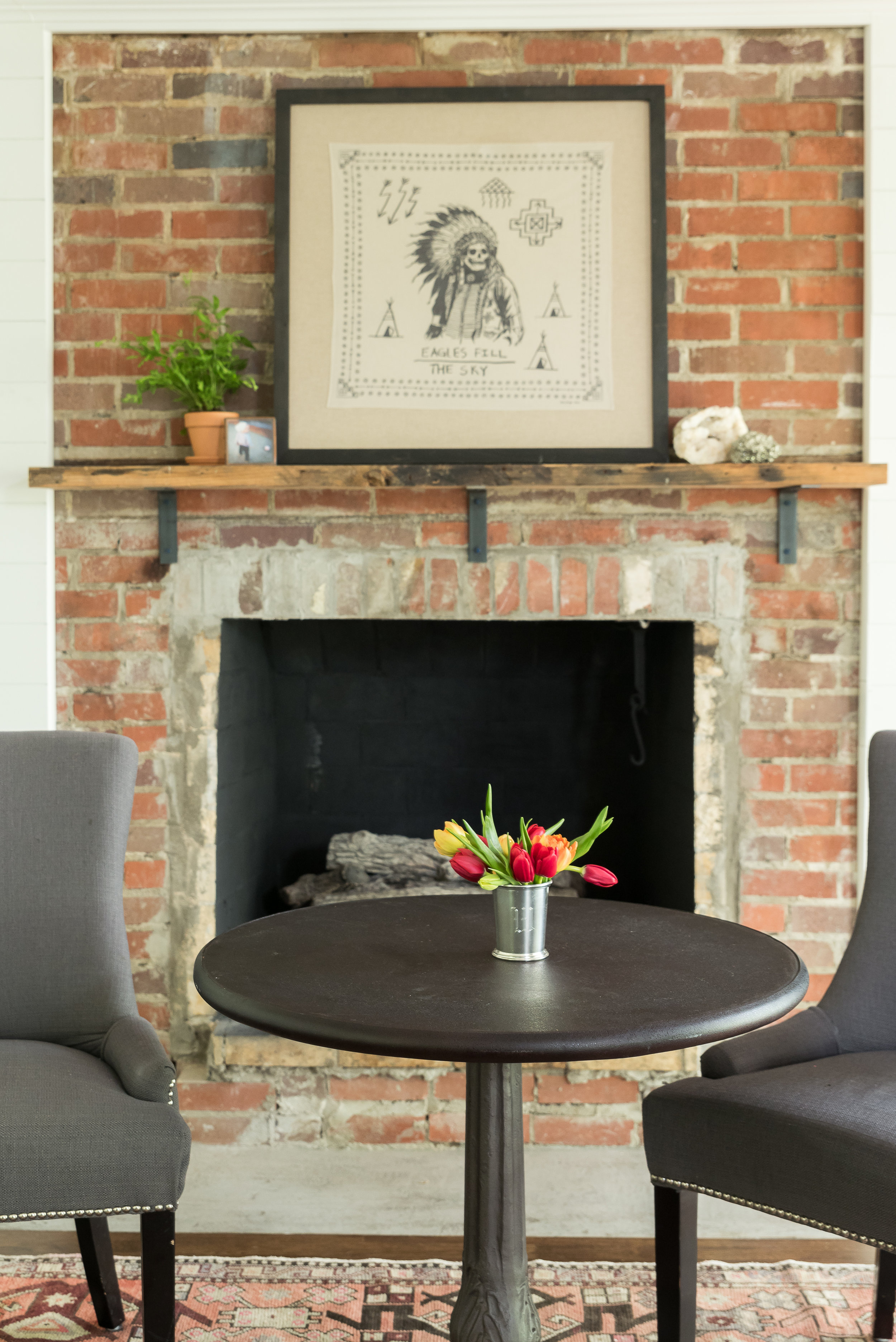
all of the stone around the fireplace had to be torn out due to the sheer mass of the thing creating a structural nightmare....all of that weight was causing that area of the floor to sink. we intended to use shiplap and a concrete slurry around the firebox....but then we discovered what was underneath all that wood and stone, this gorgeous vintage brick. jackpot.

after seeing what was there, we just couldn't bring ourselves to change it too much. we cleaned it up, got rid of some jagged edges, painted the inside of the firebox and added a mantle. it's a thing of beauty folks. perfectly #hipsterfarmhouse.

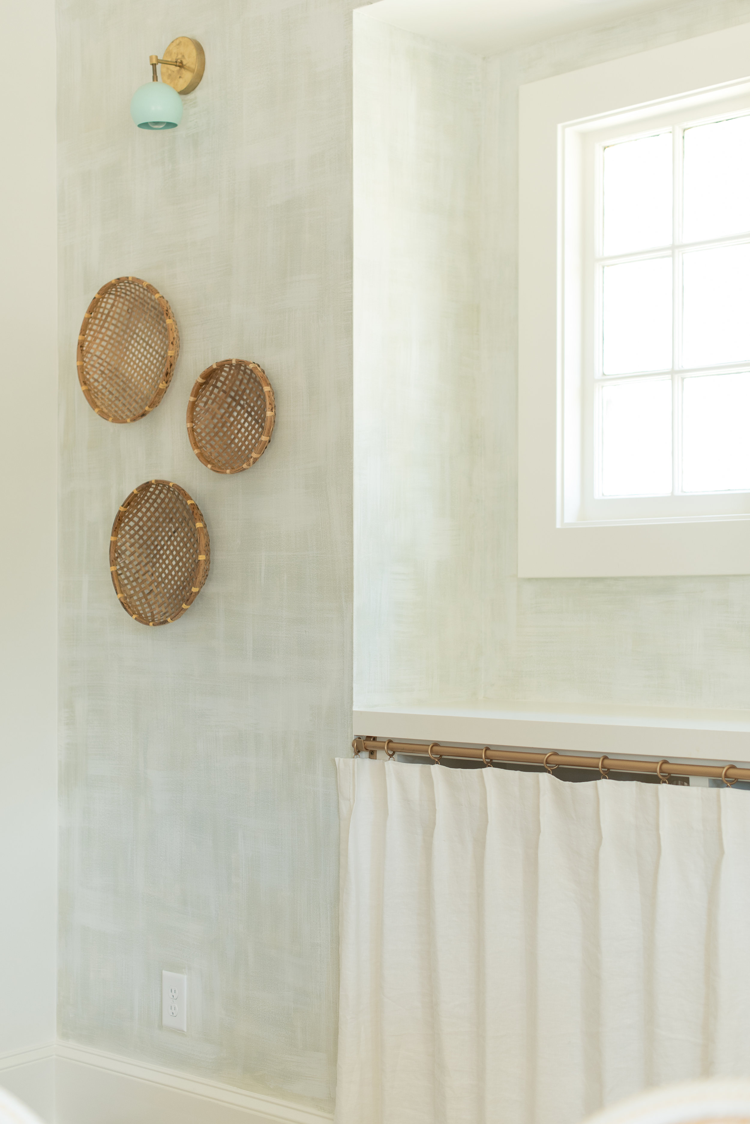
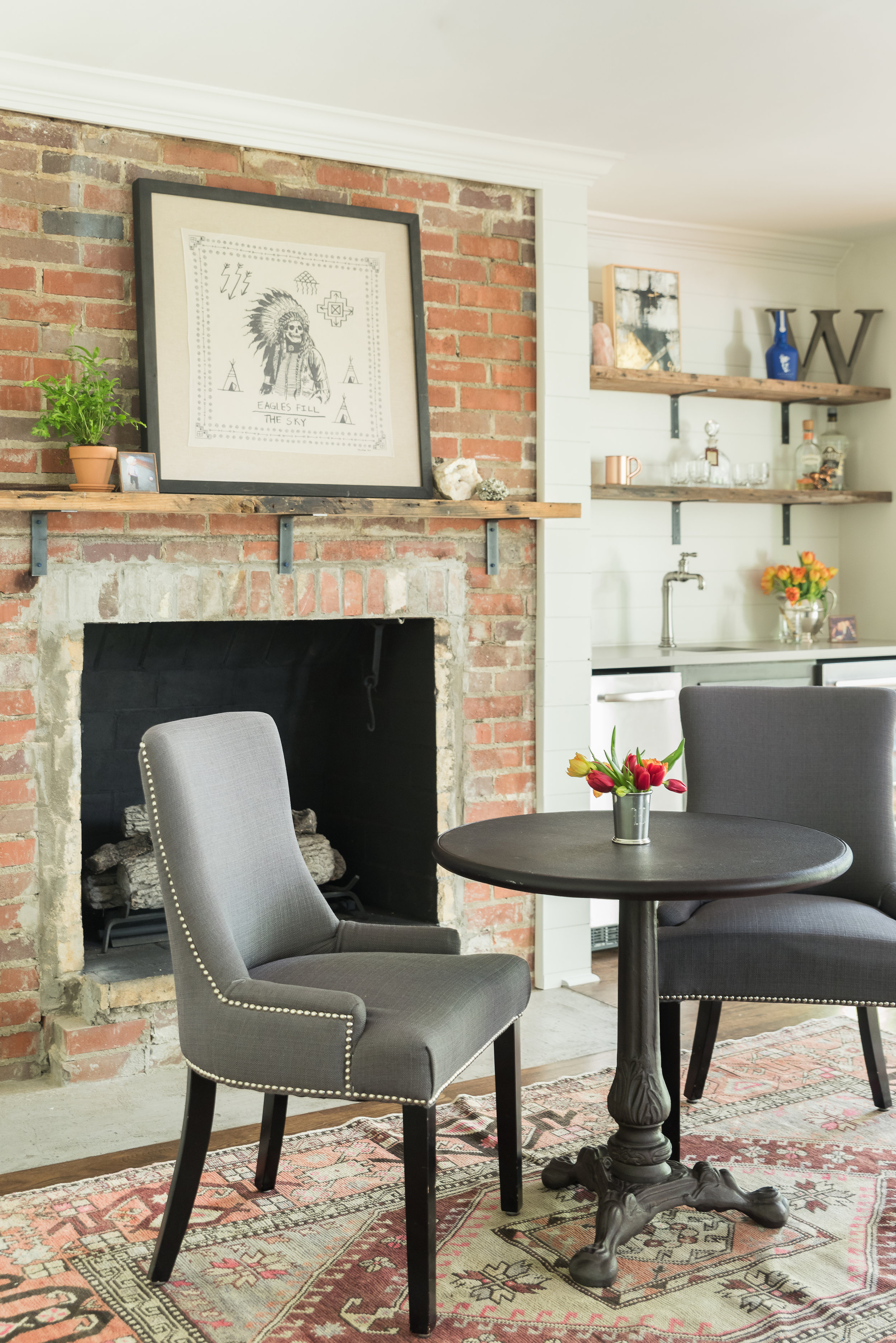
there was a little recessed area to the right of the fireplace. it was literally calling for a built-in bar. again, original cabinets were repurposed for the piece and we used the same salvaged shelving above the bar.

for more pictures on this project, visit the portfolio page and check out the hillwood project.

- R.

#projectwashedinwhite

 well, my friends, it's been awhile.  i am officially the most inconsistent blogger ever. BUT.....I have some fun, new projects that recently wrapped and I'm ready to divulge some details.

so, first up is a 12 South project that entailed a remodel and addition (we converted the garage into living space/kitchen area). the name of the game for this house was to open it up, let more natural light in, and find the biggest slab of carrara marble in all of nashville for the enormous island (for real though, there was only one big enough for the challenge….it made our decision very easy).

I’ll use our before and after photos as a visual walk-through of the transformation...

- the details -

we opened up the wall between the kitchen and the garage, allowing it to get finished out into part of the kitchen, a new laundry area and a mudroom at the back of the house. we gained so much interior square footage by using a large space that really just served as storage.

once that was complete, we added a new window to the left of the range to match the existing window that was there, and a new set of french doors off of the kitchen that now lead onto the deck. it allows for great flow, but also much more natural light filtering through the house. so much brighter!

a huge slab of carrara marble was used for the island countertop and we used a quartz (caesarstone in blizzard) for the rest of the countertops in the kitchen (and the bar). we found the perfect hand thrown subway tile for the backsplash at mission stone and tile (now stone source).

a custom mudroom with twin wardrobes and a floating bench made of ash now anchors the back of the house. originally the laundry was in the kitchen, just off of the eat-in area, but we took the laundry out, blew out those walls (and doors) and added a built-in bar. we ended up tucking in a sweet little laundry room next to the new mudroom in the back of the house. plus, the new bar is completely functional for entertaining, while still opening up the home to the main living area.

near the bar, we added a custom banquette storage bench to serve as the new eat-in area, and a table that can fold to the size of a traditional console table, or unfold to a full dining table. it never hurts to have so many options.

in the front of the house, we made a simple update to some tired stairs. you see these stairs right when you walk through the front door of the house - they used to have a handrail atop drywall and be completely closed off. to give the allusion of more space, we took down that stair wall and used iron balusters. this made such a big difference.

sources: countertops - smokey mountain tops & agm; pendants - (banquette) lulu and georgia, (island) hermitage lighting; table - bliss home; tile - mission stone and tile; oil on canvas - sarah ella cole; floor stain - dark walnut; rugs - apple & oak

if you have specific questions about sources or the process, don't hesitate to leave a comment! i'd be happy to provide more information.

until next time...

R.


Handpainted Walls.....Ooh La La

I love original art. It's lovely and comes in all different price points - believe me, you can find affordable artwork for your home. There are times that original art will cost you less than a reproduction print. You just have to hunt. Or, if you're lucky, know an artist firsthand.

Earlier this summer, a friend was telling me how she wanted to wallpaper an area of her home. We discussed options, what wallpaper she had seen that she liked, and then we also discussed budget. Wallpaper can be pricey, because you are paying for the material and also for the labor of install.

Plus, we knew we wanted this wall to be like a work of art - a real statement. Totally unique. That got my wheels turning....what if we make the wall a true work of art and have it hand painted?!

We met with a local artist, discussed color palette and different textures/prints we liked. Sample boards were provided by the artist (super helpful because we actually ended up doing something completely different than we originally planned) and then a final design was chosen. We went with a simple linen effect that transformed that wall in a big way. Stunning. One of my most favorite projects EVER. This accent wall makes the whole room feel so elegant. While it looks like wallpaper, and many assume it is, you know it's special.


On a personal note, I had the most boring powder room in all the land, so I recently called up that same local artist (Ms. Sarah Ella Cole, @sarahellacole) and told her that her superb painting talents were needed. I pulled some photos of wall coverings I liked and voila.....my powder room now packs a punch. And it's amazing. Bam.


So, don't be afraid to go against the grain....get crazy. Especially with paint. I mean, what's the worst that can happen? You don't love it? Paint over it. Have fun with your décor and your home. If you love it, go for it. And, make it original :)

The Scale. It Does Matter.

So, here's a little secret (that's maybe not so much of an actual secret): When it comes to interior design and decorating your home, scale and proportion are of utmost importance. It can make or break the entire look and feel of a room. 

Scale: the comparative size of one or more objects and is an absolute fixed measurement. Proportion: the balance between design elements, such as shape, color and texture.* To put it simply, "scale" is the size of things. "Proportion" is the relationship between them.**

Keeping those two things in mind, here are some quick helpful hints to take into account when designing a space on your own:

1) Measure. Please, for the love of all things holy, get a measuring tape out and measure your space. Don't eyeball it. Furniture will look waaaayy different in a store than it will in your room. And, furniture isn't cheap, so before you drop a dime on a new sofa, measure your room, measure the ceilings, measure the amount of space the windows take up, etc. 

2) Map it out. You don't have to have fancy interior design software to draw out your room accurately. Get yourself some graph paper and treat every square as 1 ft. Draw out your room and then visualize the furniture you want in there - how big can your sofa be? Can you have chairs? Put your mad measuring skills to work here. You get the point.


3) Big, Blank Walls. Ah, what to do with a huge blank wall that's just screaming to be filled?! You know what you don't need to fill it with?  A million different framed pictures of a million different sizes, and then call it a gallery wall. You can go all Gallery Wall on it, but depending on the size of the wall (see above for measuring your space and sketching out your wall) you may want to go with large/very large matted frames to fill the space. Or choose to have one focal point for the wall and leave some white space. Scaling back on a large wall instead of filling up the entire space is going to be a safe choice. It will be more visually pleasing to the eye. If it looks overwhelming, the space is going to feel overwhelming.

4) Seating. Say you have a small room, but you need ample seating. Remember, measure how tall your ceilings are. This will help you decide how big in stature your furniture can be. Typically, the smaller the room, the smaller and more delicate the furniture should be. Unless, you are making one large piece the focal point of the room. Regardless, keep your walkways in mind. How will people get to the sofa? How will they walk around to sit in that chair? Many times, in tight spaces, no side tables are needed. If it's tight, a nice coffee table in the middle will work to suit everyone's needs. A round coffee table also makes walkways more accessible in small spaces. In large spaces you can use bigger furniture, but please, be careful not to overcrowd the space with too much "stuff".....just because the space is larger doesn't mean you need to make it claustrophobic.

4) Symmetry. If you aren't super confident in your DIY decorating skills, stick to making your rooms and walls symmetrical. This will achieve the allusion of proper proportion and makes for an easy guide for yourself. If you feel good about what you want in your home and how you want to make a statement, use the Golden Ratio to help you in terms of scale and proportion for furniture layout and art walls. Release your inner math geek.


5) Color. Keep a similar color palette throughout your house. This provides a nice flow from room to room, and also becomes a cohesive driver to make things look in proportion to one another. That doesn't mean you have to use the same colors in every room, but stay in the same families, and use the same tones and shades.

Good luck and happy measuring,

Rachel


*SF Gate Home Guides
**marycook.com

Budget, Schmudget

A living room for less than $1.5k.

I recently had the privilege of furnishing and styling an Airbnb bungalow. Cutest house (see Operation Purple Haze post), but a major project that could have gotten out of hand in the budget category.

Anywho, this house needed to look fab, desirable, and fresh.....but on a rental budget. We needed good quality and clean, sophisticated lines without going crazy on expenses. This is actually the story of my life when it comes to decorating my own home, so I thought I would share with you some idea boards and sources that I frequent. There is a way to love where you live and do a major overhaul on your home styling without spending an arm and a leg (and without squandering quality).

Here's another thing to remember, shop local. Sourcing items that are locally made, or at least from your smaller stores, tend to be distinctive. They are things that others aren't going to have because they aren't sold in such mass quantities. 


Sources:

Ikea: Ikea is the best. If you know me, you know my love (on the cusp of an obsession) with Ikea. They have great stuff, and banging storage solutions. They are smart. So smart. And......they aren't so proud of themselves that they charge a fortune. They are a go-to for me. *Side note, specific to this Idea Board. We needed swivel chairs for this room so that anyone sitting in the Tullsta chairs could turn to watch TV if desired.....quick, DIY fix: the bottom of the Tullsta chairs are wood, so we ordered some heavy duty swivels from Amazon, took the legs off the chairs, and attached the swivels to the bottom of the chairs. The chair skirt hides the swivel. Functional and doesn't look like a 90 year old owns it (I find that most swivels chairs err on the side of looking outdated as all get out).

Home Goods: Oh, Home Goods. That's the place to go for all of your home styling needs. Mirrors, artwork, filler pieces (i.e. vases, bedside table pretties, etc). It's very hit or miss, but when you go on a good day, man, it's amazing. Load up that cart.

Target: I mean, who doesn't need an excuse to hit up target. Stock up on new bath and bed items here. Great throw blankets for the bedroom, and decorative pieces with  pops of color.

Antique Store: Find a good one near you. This is my little slice of heaven. I could get lost for hours in the one I frequent (Gaslamp Too in Nashville). Find unique and original art, accent furniture and items that tell a story. Vintage finds always make rooms more interesting. I love, love, love mixing old and new. It makes things less rigid and blah. Warm it up with antiques.

West Elm: Love me some West Elm rugs. Always eye-catching and always spot on. Rugs can get $$$, but WE does a great job of offering most of their rugs at a very reasonable price for what you get. This is also a good spot for some seriously cool throw pillows and little decor items.

And there you have it, the recipe for a lovely living space on a budget.

Happy hunting y'all.

Rachel


Get A Fresh Pair

Well, we finally made it back from our big summer adventure across the US, toting along a 5 year old, 3 year old and 8 month old. Let me tell you all...America, she is beautiful. Gone for two solid weeks - camping, tee pee sleeping and hikes galore. Loads of fun, but it's always so good to come home.

(Just call us Clark and Ellen)

Full disclosure, if you haven't figured it out already, I am a complete dork. I am one of those people that cleans our house before we leave for trips. There's nothing better than coming home to a clean house, and nothing worse than traveling and coming home to a dirty house. Plus, it allows for a fresh perspective once you get home.

A couple of times of year, when we are gone for a week or more at a time, it gives me the chance to walk into our home upon return and look at it with a pair of fresh eyes. It's like seeing it for the first time again. You see the good, and you see the bad.

There are times when my freshies see things that I love and I impress even myself. And then, more frequently, there are times that I am slightly appalled by some styling choices I have made in my home (i.e. why is everything so cluttered). It's amazing what your eyes get used to when you see the same things day after day.

I am currently reading two books (see dork comment above). Terrifyingly to my husband and children, they are 7 (Jen Hatmaker) and The Life-Changing Magic of Tidying Up (Marie Kondo). A fierce combo. If you know anything about these books, you understand that my family has some legitimate concern about coming home to an empty house and being fed spinach and sweet potatoes for weeks on end, while surrounding themselves with things I find "joyful".

But, I digress.....back to the point. Use these breaks from your house to come home, assess the space, and find ways to make your home exciting. More often than not, it just takes getting rid of things, clutter, excess. This does not mean you need to go out and buy new pieces. Move things around. Switch rugs in different areas of your home (my daughter just lost her bedroom rug to the sitting area). Rearrange your chachkies, or just put them away for awhile. Create a blank canvas if you need to so you can really see what lays behind all that "stuff" we all unknowingly accumulate. Find a way to channel your inner Marie Kondo and find sparks of joy in the things around you, the things that already made the cut. Clean it up.

And, if all else fails, just go back on vacation.

Keep it simple, keep it real, 

Rachel

And they all came tumbling down...

This is one of my favorite happily ever after stories ever, mostly because I get to revel in all the glory of a perfect renovation (and by perfect, I mean perfect for the end-user, which is how it should always be measured). Please, soak in the beauty of the before.

Notice the four different types of flooring....yes, four. Count them. Parquet in the front foyer (sounds way fancier than the area actually is), and then a different parquet in the "den" off of the kitchen.  The kitchen had that classic faux brick linoleum and then the dining room (back left) had a lovely carpet, with no hardwood underneath, to my dismay.

Once we had committed ourselves to the thought of buying this house/we had actually signed a contract so there was no turning back, we tried and tried to figure out a way to make the kitchen work. But that door. That damn door. You may not be able to see it - it's a chameleon amongst all the wood paneling. And then there was another door (just south of the fridge) that totally ruined all plans of an open kitchen/dining/built-in hutch area.

So, here's what happened:


1) All the walls came down (along with several others you can't see from this viewpoint). And it's amazing. I hope we made the previous owners proud. The dining room became a sitting area that is the hub of our home. It's pretty much in use, all of the time. 

2) One flooring for the whole house. Including what lies beyond that chameleon of a door, which is now the finished garage, turned bar/mudroom/office (who doesn't lump all those into one room???). In this house we chose an Australian Cypress. We wanted something similar to hickory with a touch more warmth.

3) It took us two weeks (two weeks!) to figure out that we could (duh) move the doors to create a larger kitchen/dining space. The wood door was filled in and became our pantry; a dutch door took its place to the left of its original position. What you can't see in this "After" shot is that the door to the south of the old fridge is where the current fridge now resides (in the sunroom behind that hole is a lovely bookcase to fill the void). Essentially we popped a fridge in the space where the door used to be, filled in the back of that with a bookcase,  and then made a new opening elsewhere (which now leads into said sunroom).

So, here's the deal, sometimes it doesn't seem possible to find the house of your dreams, or to even love the house you're in.....but it is. Even underneath four different kinds of flooring and walls galore, the possibility is there. You just need a little imagination, and maybe a lot of wine. 

Peace,

Rachel


Operation Purple Haze

Operation Purple Haze was, simply put, making a purple bungalow even more fabulous than it already was. It is in one of Music City's hottest neighborhoods, close to everything, it just needed to reflect the style of the new owners (who, for all you travelers out there, have decided to Airbnb the joint).

Working on this house was a little like being a first time homeowner. It wasn't just a paint job (there was A LOT of paint), it was everything: the furniture, the beds, the silverware, the trash cans...you get the point. That being the case, and that we wanted to get this done during the month of June, priorities were key. So, here are some important things I learned that may help you:

- When in doubt, always spend your money on a great rug. People remember great rugs. They make a statement and they can be beautiful, or a hot mess. Let's try to make this world a beautiful place, people.

- Bedding: If you are like me, I want new bedding every 6 months. So, here's the thing, keep it simple. Go white (hello, bleach) and get some amazing, colorful throw pillows to fill up the space. This way, your foundation is simple, clean and timeless. Then, you can go trendy on the pillows, which will cost you a lot less than the bedding.

- Order the big things online if you can. This saves you the time and hassle of getting it home or scheduling a delivery, and free shipping is handed out like candy these days. Spend your time selecting, sourcing, and loading your car with great artwork and accents instead of the large items.

- Have a color scheme that flows throughout the house. That doesn't mean that every room has to have the exact same colors. For us, one living space had primarily grays and blues, as did two of the bedrooms. The main living space had grays, blues and coral, as did another bedroom. All of the rooms tied in a lot of white and natural wood elements and the wall color was the same throughout, making the whole house cohesive. Do this to make sure the final outcome isn't choppy or like one of those bed and breakfasts that has themed rooms (there's no shame if you enjoy those, by the way).

- Make yourself a spreadsheet. A quick styling makeover of a room or two may not warrant this. Getting an empty house ready to be a lovely Airbnb does. You'll be amazed at the time saved dorking out over an Excel spreadsheet. 

And, that's all folks. It's been real. Until next time.

Rachel

* A special thanks to Emily for letting me run wild with this and never wavering in her faith in me. And another big thanks to Mary Craven Dawkins for continuing to take pictures that make me look far more talented than I am. So lucky to work with such great people.          

Mary Craven Photography      @marycravenphotography     marycraven.squarespace.com


The Before

The After